I’ve recently been engaged in several data-related projects that have taught me a lot along the way. Outside of geeking out over portfolios and books on the subject matter, my knowledge is limited when it comes to the methodology of collecting and visualizing data is pretty limited.
The first project that had me dig into this skill set was creating a customizable framework of data visualizations for our (Microsoft News) Elections 2020 experience. This is still in the works, so no photos to share just yet…However a resource I found early on helped me out considerably when deciding what graphics would work best to convey a data set. The website is called The Data Visualization Catalogue and is essentially a library of different visualization types, which can be sorted by appearance (i.e. bar chart, line graph, etc) or function (i.e. patterns, data over time, comparisons).
The second data-centric project I got to be involved with was an article for The Pudding that was researched, written & coded by Amber Thomas. I was brought in to help with design and visualizations, though the project was highly collaborative and I learned a great deal from Amber in regards to how data is collected and how sensitive it is to being manipulated by the wrong graphic representation.
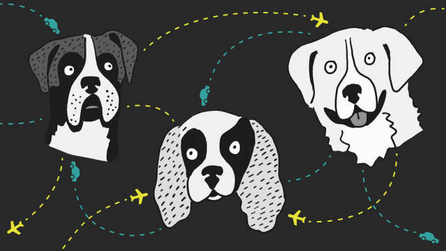
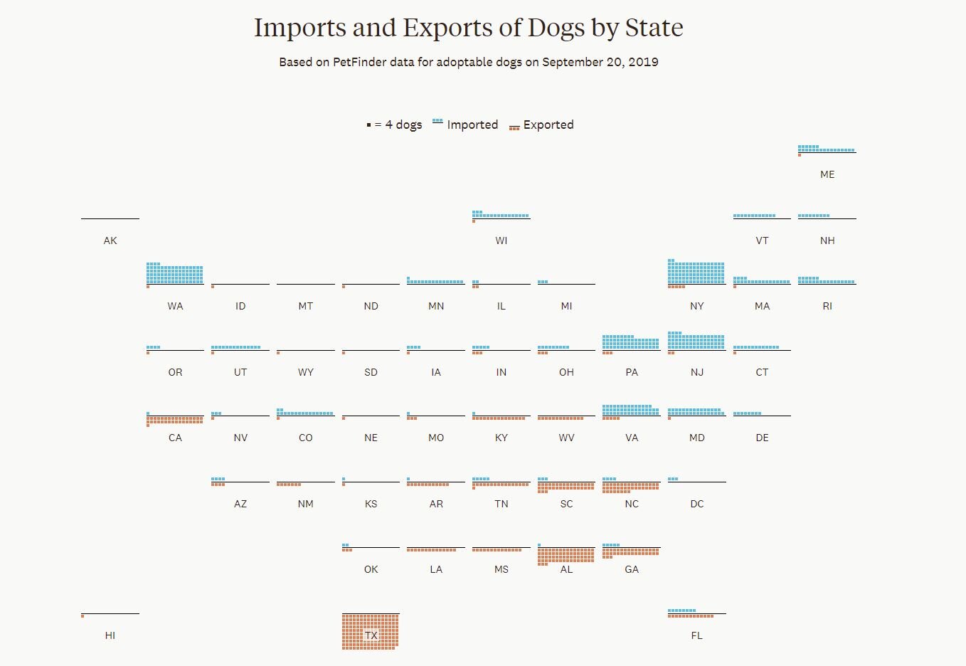
One such example was an early brainstorm we had about how to represent a North vs. South migration pattern. For context, the article we worked on looked at where adoptable dogs come from or are sent to using data collected from Petfinder. Below is the original graphic we created to show the direction of migration for each adoptable dog:
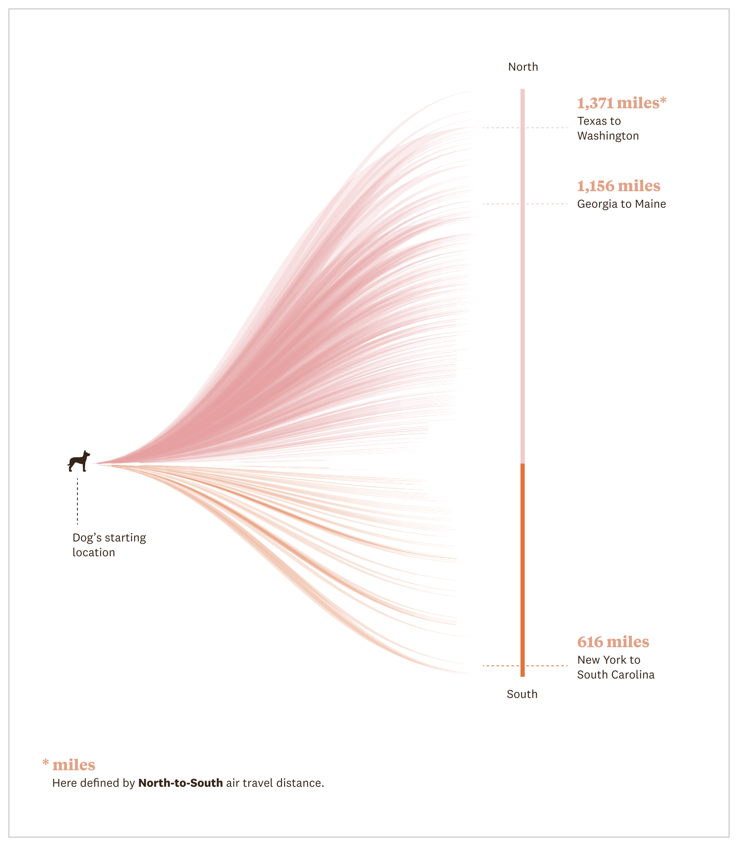
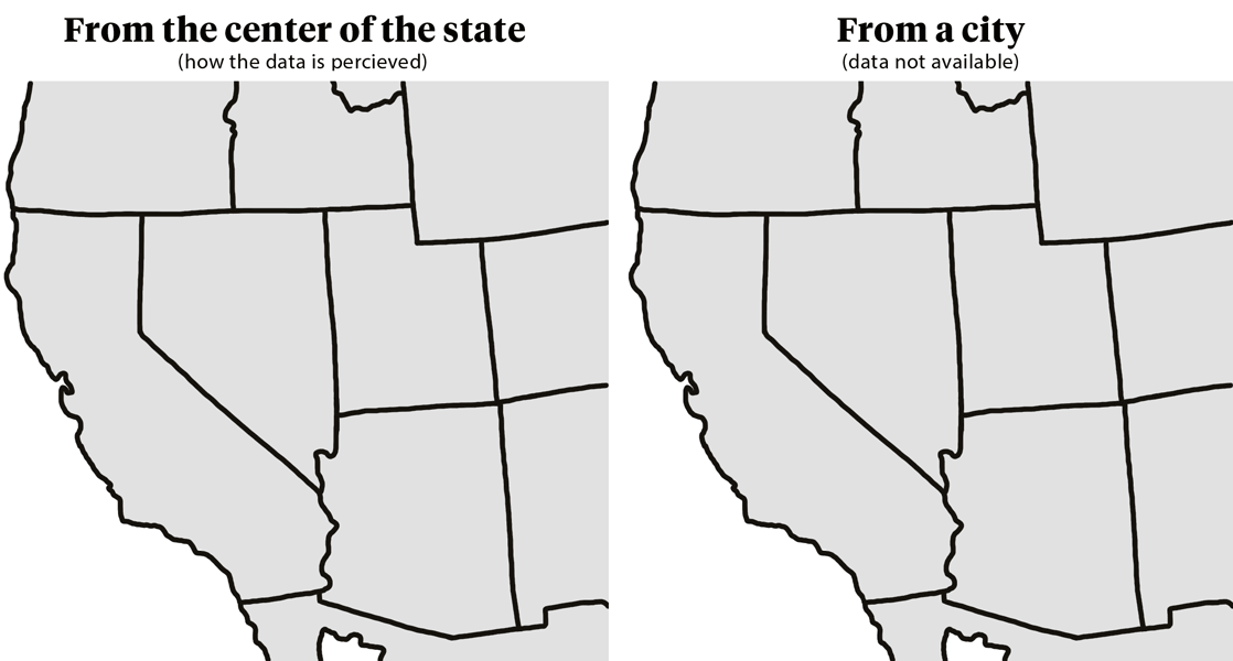
The problem with this visualization was that we only had available to us the origin & destination points as U.S. states, so a dog traveling from California to Nevada would register as having traveled slightly north as the distance being measured came from the center point of each state. This becomes problematic when you realize a dog could be coming from San Diego and travelling to Reno, a distance that is not only greater, but further north.
In the end we decided the best and most accurate way to represent this data would be to show the total number of exports and imports by state. This way the reader can quickly scan the two data points by location and see the pattern the data is showing, which is more dogs travel from southern states to northern states (with some exceptions).
Overall, lots of interesting learning moments and opportunities to flex my creative muscles by engaging in some interaction design and illustration. To see the whole article click here or the image below.