It's week 7 of quarantine and my new norm consists of endless hours playing my Nintendo Switch, watching old episodes of True Blood, and communicating with friends and family on an assortment of video conferencing apps. FaceTime and Microsoft Teams have been my go-to prior to the pandemic (and remain in high use today), but I've since brought Zoom into the fold and have really enjoyed it. It isn't platform-specific (like FaceTime), and doesn't feel enterprise-specific (like Teams, which I've only known within the context of the workplace). Which is why Zoom emerged as the clear candidate for hosting my family's weekly hangouts.
My mom was already a daily user of Zoom and my sister, by virtue of being a millennial, took to it in no time. However, getting my Abuelos prepped for our first group video chat was another story. A bit about my Abuelos: They're both in their early 80s and are pretty tech-savvy. They have an iPhone 8, Samsung tablet, Roku stick, and PC. They bank online, check email on various devices, and use Instagram.
My girlfriend bought a Zoom subscription and set up the first test-run for my Abuelos. Together over FaceTime (an app they recently mastered) we walked them through how to download the Zoom app from the App Store on the iPad my mom loaned them. I could go into detail about the difficulties we had with the install process (Apple ID, need I say more?) but that's not the point of this write up. It was once the Zoom app was launched that my eyes were opened to the discrepancies between our respective onboarding experiences.
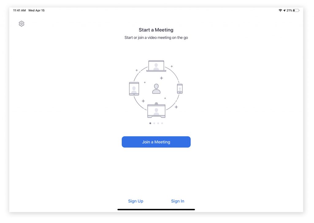
When I first loaded up Zoom I breezed through the screens. I didn't pay any attention to the call to actions in smaller fonts or the settings cog in the left-hand corner. I just went straight to the large CTA button trusting that the visual hierarchy of the page would lead me to the action I'd most likely want to take. This was different for the Abuelos, who gave equal importance to each item on the login screen (fig. 1). Their response to this screen opened my eyes to two learnings:
- Visual hierarchy alone cannot guide a user to the right action.
- The onboarding carousel was useful to them, but not in the intended manner.
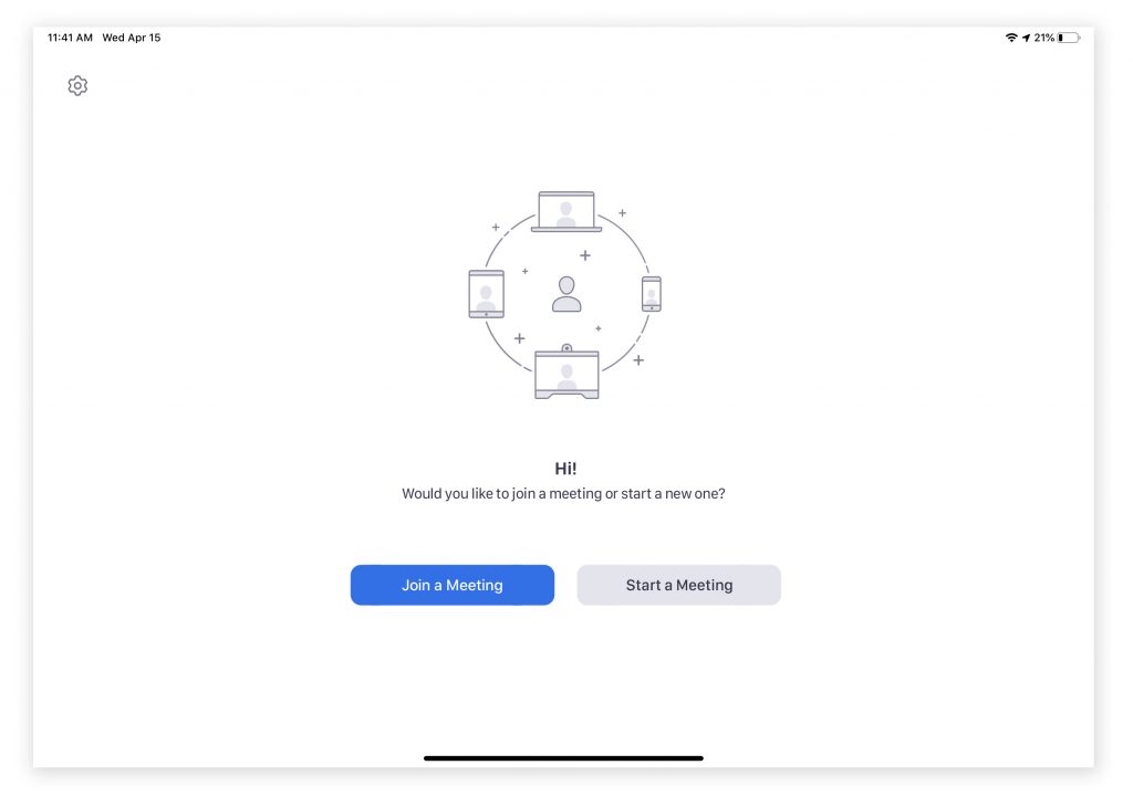
It's clear from the contents of this screen that the most important goal is to get people in a meeting--either by starting one or joining one. It could be helpful to include conversational text that guides a user to the action that matches their intent. In reading all of the text available on the screen, the Abuelos would've benefited from contextual guidance that echoed the language in the CTA buttons: "Do you want to join a meeting or start a new meeting?" (fig. 1.5).
On the second point, I realized how accustomed I've become to having a marketing moment on the home screen to the point that I didn't even acknowledge it. It's an easy way to quickly run through the product features and orient the user. However in my Abuelos case they viewed it as a decorative illustration that happened to be sandwiched between text that had no relation to each other (Start a meeting vs Join a meeting). When looked at holistically it caused confusion, however the illustration on its own later came to signal for them that they were on the correct screen for joining a meeting. In this way they found a different way to engage with the carousel that brought value to their experience.
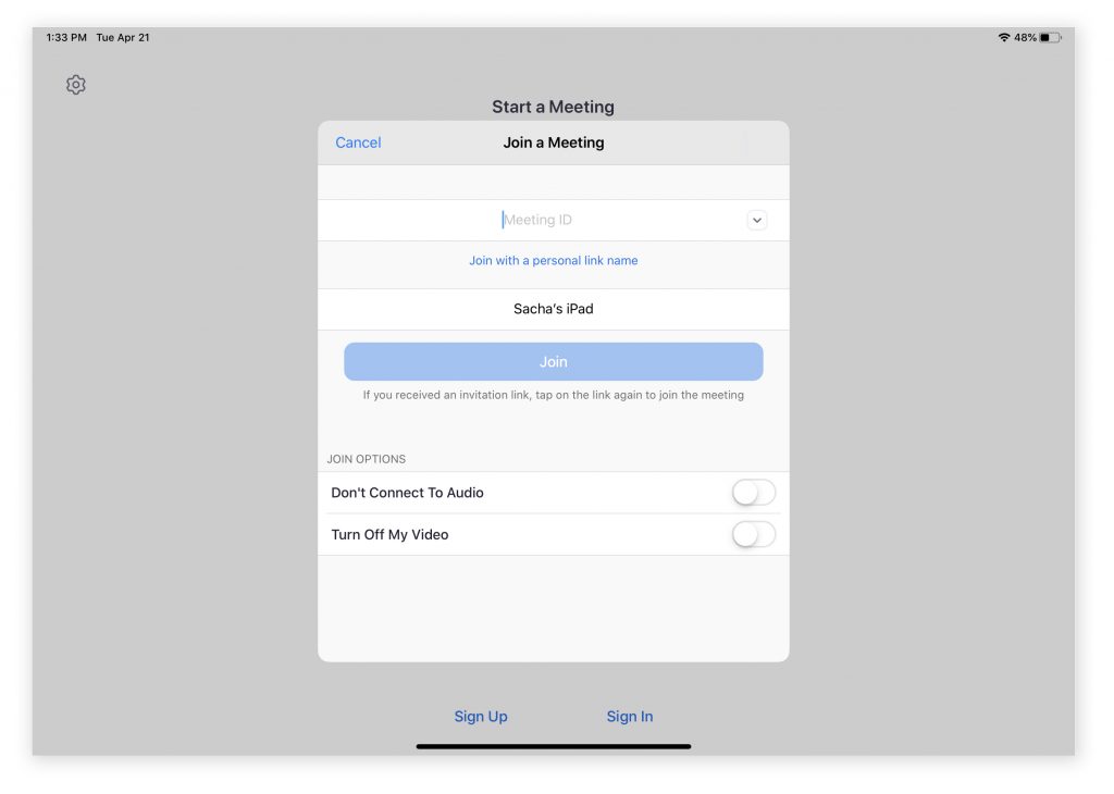
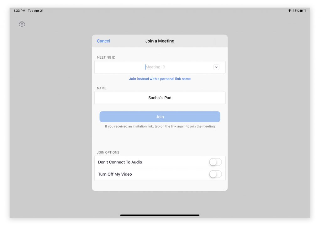
The second screen in our journey (fig. 2) proved to be especially painful to guide the Abuelos through because of its' treatment as an overlay. Upon seeing this screen, Abuela asked me if she should select "Start a Meeting", "Join a Meeting", "Meeting ID", "Don't Connect to Audio", "Turn off my Video", "Sign up"... Basically, anything visible to her in that moment was an equally important action to take. Rather than be focused on the path to join a meeting, she was distracted by the UI elements available beyond the overlay form. Positioning of the form was also unfortunate as the title for "Joining a Meeting" was preceded by "Start a Meeting" in a larger text size. By reducing this visual clutter (fig. 2.5), I believe Abuela could've focused better on the form itself.
It was also difficult for me to explain what it meant to "Join with a personal link name". As far as I knew Zoom meetings were joined by clicking on a link or manually inputting the meeting ID. It was at this point that I got out my own iPad and downloaded the app so I could see exactly what she was seeing and guide her better through the experience.
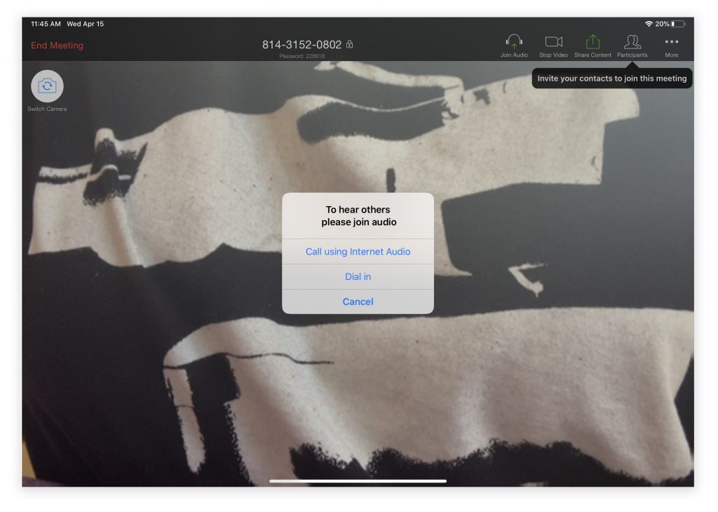
The final few hurdles we had to get through were all specific to the operating system: granting permissions, or as I explained to Abuela "Sigue empujando 'OK' y 'Confirm' hasta que se desaparecen." The last of the dialogue boxes to pop up came from Zoom (fig. 3), requesting we join audio but in a way that didn't make sense to any of us. Call using Internet Audio? Dial in? It would've been clearer to have indicated the device tied to the action. For example, use the audio of your iPad versus audio on your phone. It does raise a question: if a user has granted access to the app to use a device's microphone and camera, why not default to that option of audio input/output? However, elevating this settings control makes sense if Zoom is finding that a significant portion of their users are opting for dial in on their calls.
Since our initial test-run, the Abuelos have since used Zoom on two separate occasions. The first was a little touch and go after they unintentionally got stuck on a "sign in" overlay and didn't know how to get out of it (the only way out was a "Cancel" text link in the upper-left hand corner of the form). But the last call we had with them went extremely smooth and you could tell they were feeling more familiar with the interaction patterns. On that subject, here are some stray observations:
- Shy UI suuuucks. Okay, I still love it because it really cleans up the experience and reduces clutter, but it took forever to show the Abuelos where certain actions were and how to evoke them. Having to preface each instruction with "touch the screen" and then rush them through before the UI disappeared again was anxiety-inducing.
- Congrats to whoever designed the Gallery View icon. It was so easy to describe the look and intent of the icon to the Abuelos and it was even easier for them to remember what it stood for. That was one lesson easily learned.
- Another plus (that is incredibly specific to the Abuelos): the ability to end a call for everyone. I wasn't looking forward to explaining how to leave or end a call (an action located in the shy nav). Luckily, as hosts of the call with the ability to end the call for all involved, we were able to avoid that lesson. For now.