Portfolio
Below is a collection of five projects that best represent the skills and knowledge I bring to the table. Some demonstrate my talent in leading artistic direction, while others showcase my ability to be an effective design partner in large engineering teams.
Election 2020 Experience
Microsoft News gets more than 200,000 pieces of content from publishing partners every day, live election results from the Associated Press, and access to in-house sentiment polling in partnership with CivicScience. It’s a lot of news and data for readers to explore--so how can design create a frictionless experience that highlights the world-class content and data we have available to our readers?
PRODUCT PRINCIPLES
As a project within the Trust Initiative, our guiding principle was building trust with our readers. We sought to accomplish this by providing ways to interact with and explore data, transparency of sources and methods, and opportunities to elevate the voices of our editorial team.
ROLE / TEAM STRUCTRE
The team was comprised of a project lead, feature managers, and developers representing areas such as editorial, tooling, telemetry, data modules, and engineering platforms. As lead designer, I collaborated with the project lead in establishing and executing experience deliverables. I also worked closely with product feature owners and developers throughout the process.
DESIGN SOLUTION
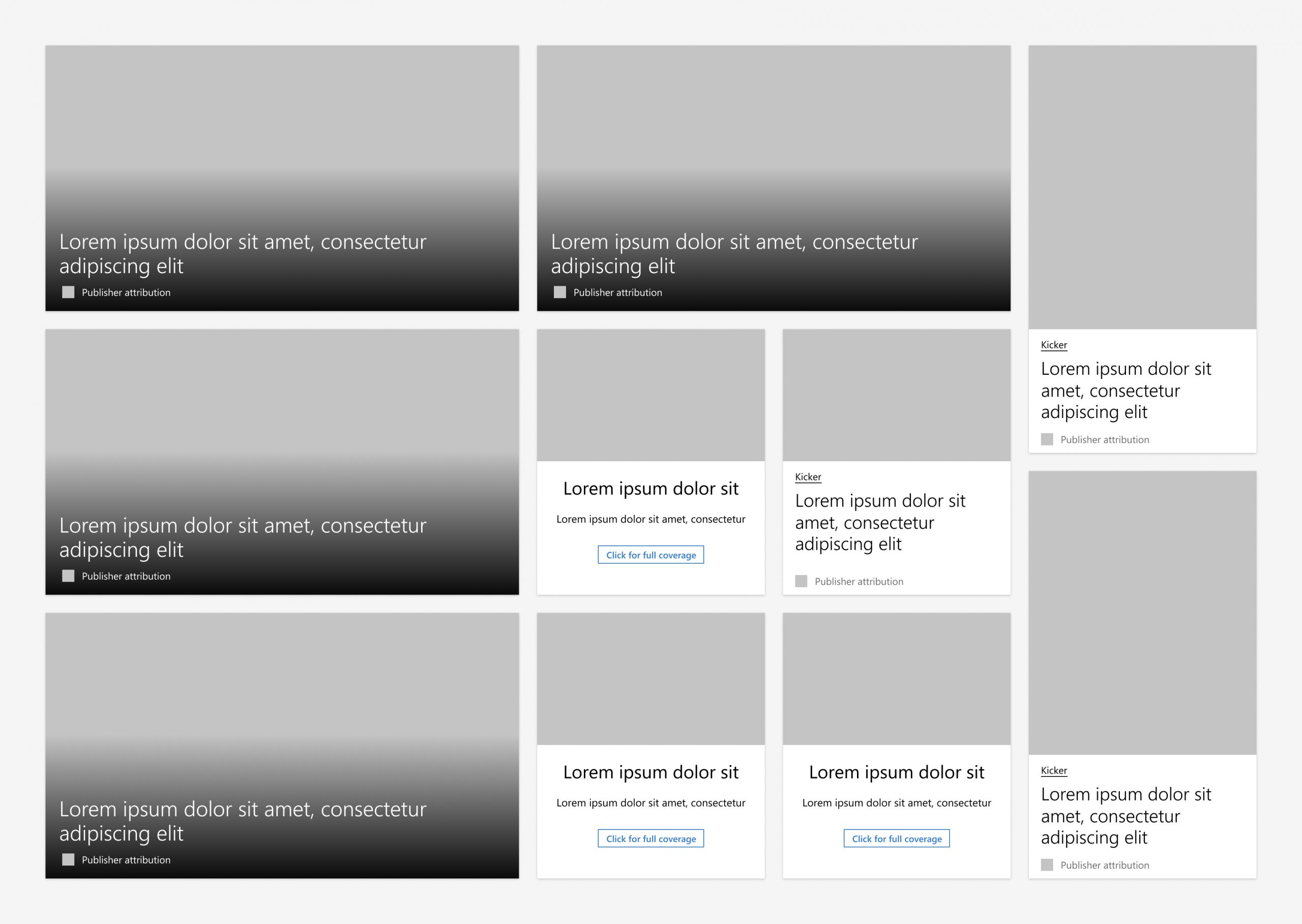
I focused my efforts into three spaces. The first was reinterpreting our exisiting card feed framework into a more branded and curated experience.
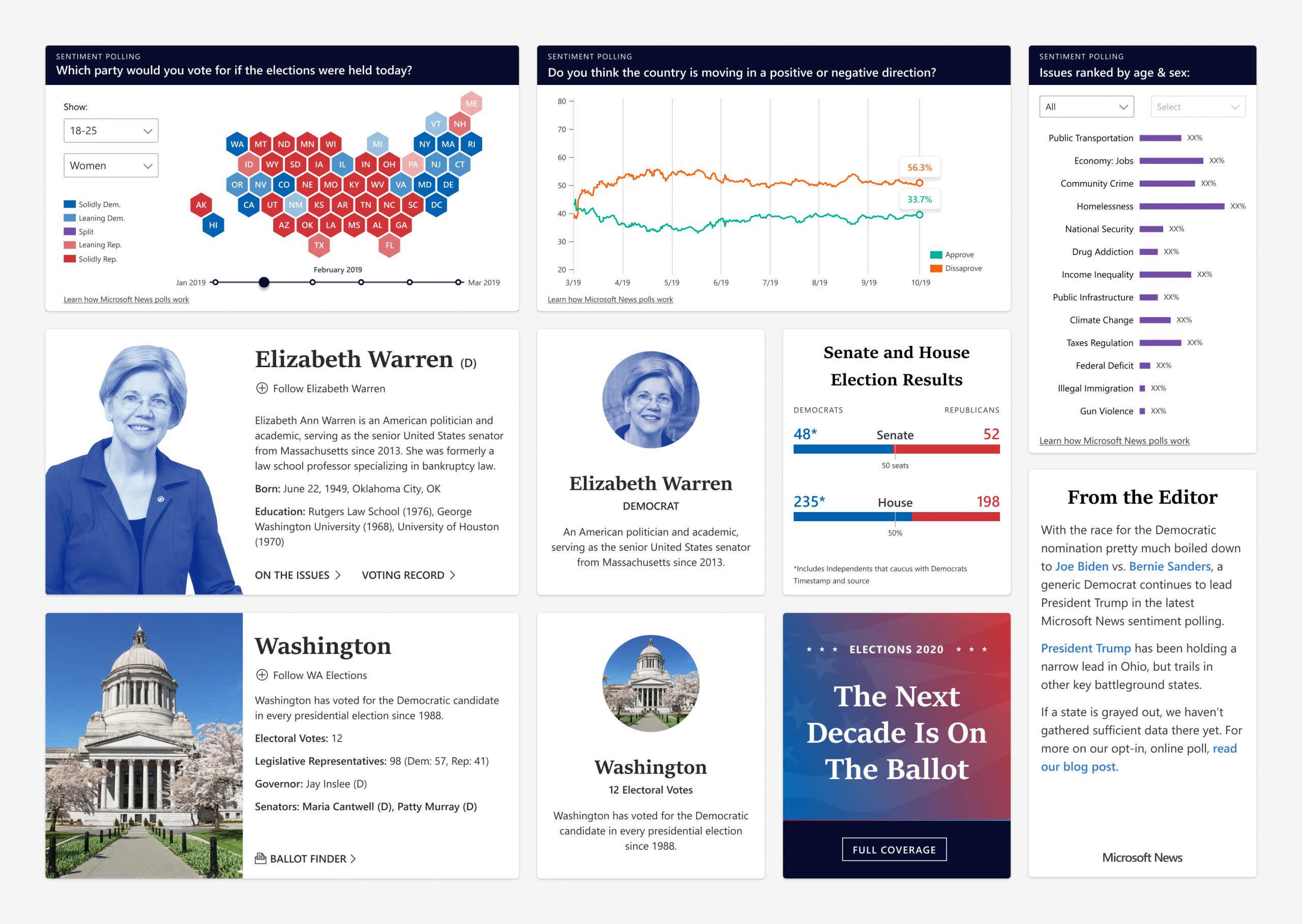
I then worked with a feature manager and team of engineers to create a responsive set of data visuals for our sentiment polling and election results (powered by A.P.).
Lastly, I worked with our editorial team to identify opportunities to introduce our editorial voice into the product
From there, I considered the way our experience would evolve throughout the election cycle and what type of content would be of highest value to our readers. In my designs, I explored three different news day experiences: pre-primaries, Super Tuesday, and election day (Nov. 3rd, 2020).
IMPLEMENTATION
One challenge that presented itself during this project was having to implement designs in the midst of a switch in engineering platforms. This meant that some of the original designs couldn’t be implemented to spec and required that I work with engineers to assess what was feasible on our current platform and adjusting in real time.
However, a success we experienced was cross-promotion with Bing’s election experience. We were able to unite in our election branding and find opportunities to enhance our experiences with each others strengths.
OUTCOME
Though the 2020 election is far from being over (as of this writing), we saw an increase in visitors on Super Tuesday (up 8.1% compared to an average Tuesday), an increase in clicks per unique user (from 5 to 9), and had a total of 25.8 million page views on our elections content from March 3rd-5th with an average dwell time of 5 minutes. Here is what some users had to say about our elections coverage:
👏
"I tried using the maps on other sites but kept coming back to you.”
👏
"It was a compliment to the TV experience - a great second screen where I could see all the states without waiting."
👏
"Your map was faster than the competition.”
I also had the opportunity to co-write a Microsoft blog post of our Super Tuesday coverage, which can be read here. Below is a short behind the scenes video (by Roberto Morales) of our Iowa Caucus war room.
The Microsoft News election coverage can be viewed live on the Edge browser new tab page, Microsoft News App (iOS & Android), MicrosoftNews.com, and MSN.com
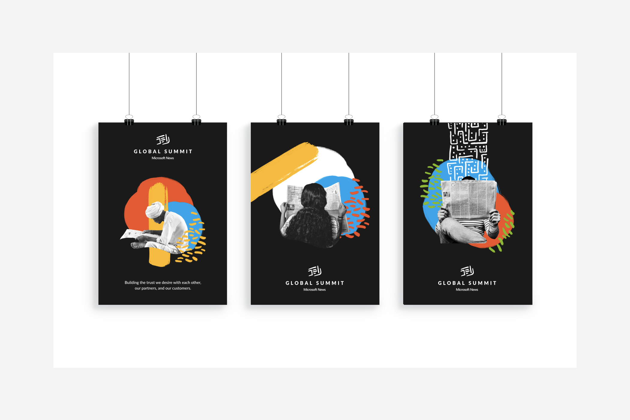
GS19 Brand
CHALLENGE
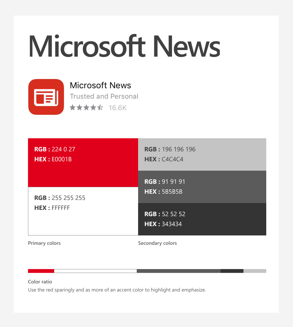
The Microsoft News brand (as of late 2019) was limited to a fontface and app icon and the promotion of trustworthy news through Microsoft’s partnership with the worlds best publications.
BRIEF
Microsoft News Global Summit 2019 centers on the theme of trust, and promotes building the trust Microsoft News desires with each other, their partners, and their customers.
Visual Explorations
Two directions were explored for how to best visualize and communicate trust and the global community.
TRUST
Employing editorial design standards to evoke confidence, professionalism, and trustworthiness.
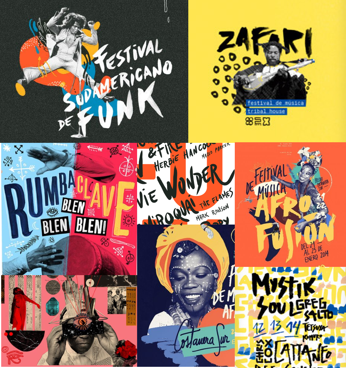
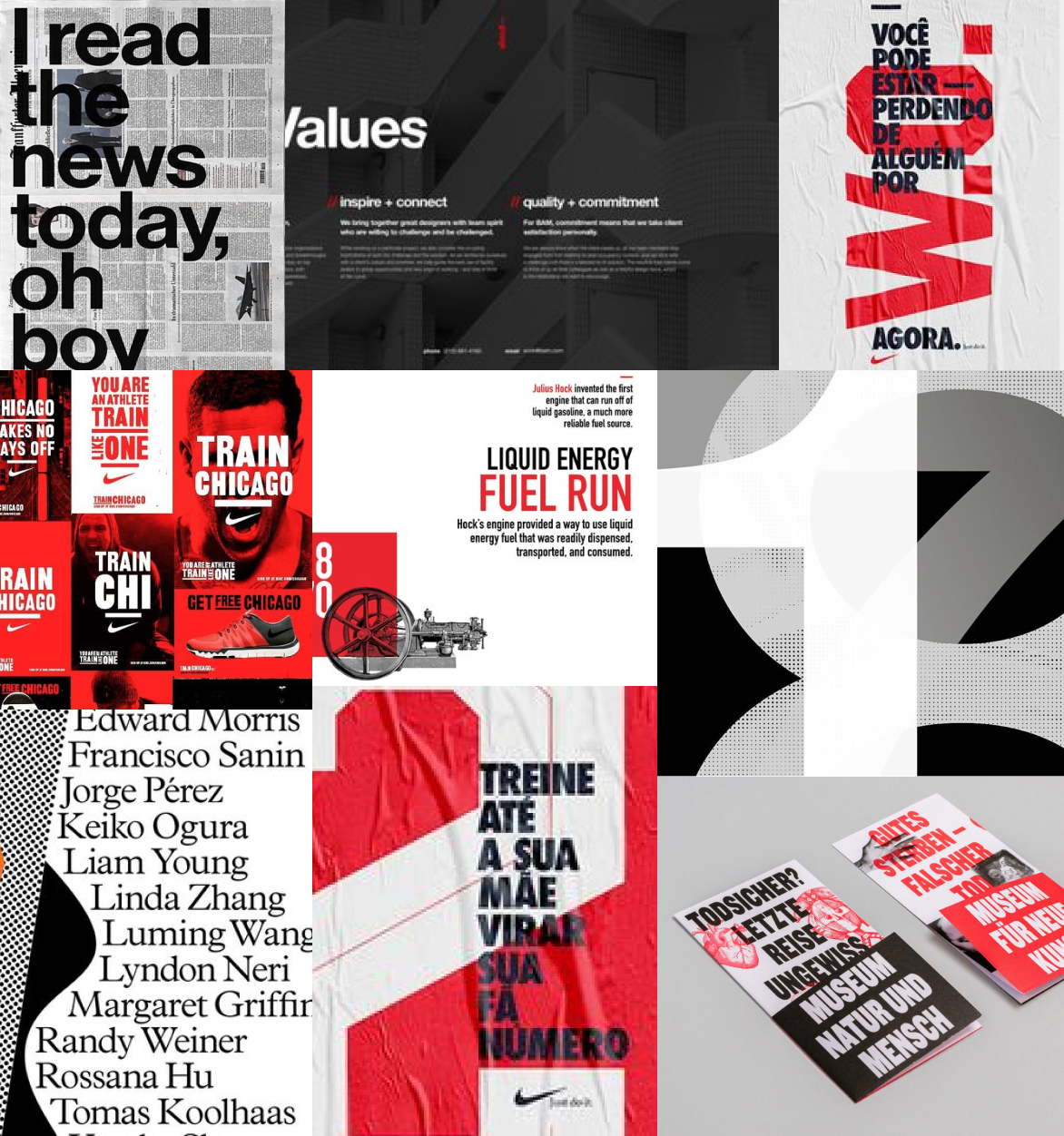
GLOBAL COMMUNITY
A celebration of diverse cultural backgrounds, shared values, and relatible in presentation.
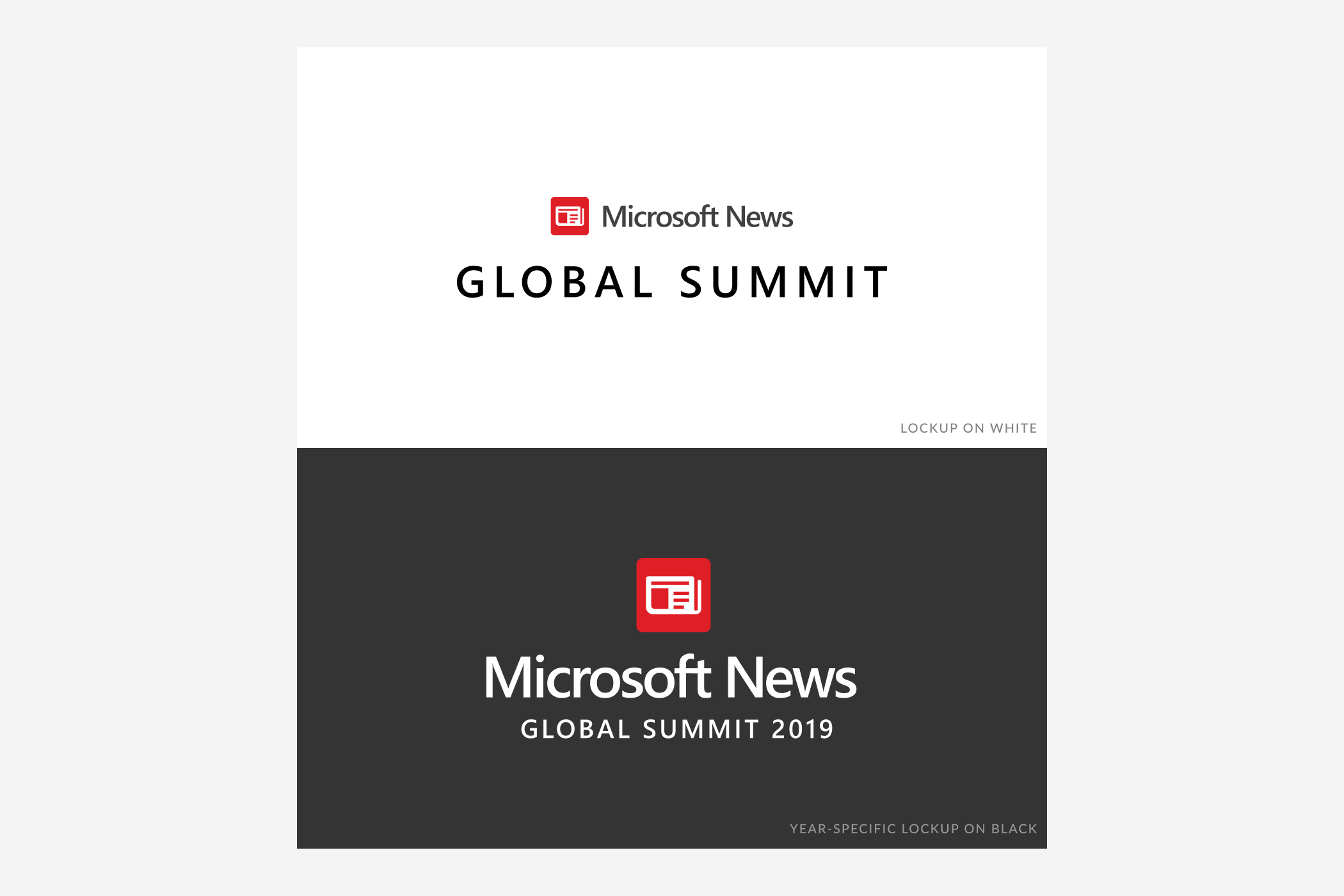
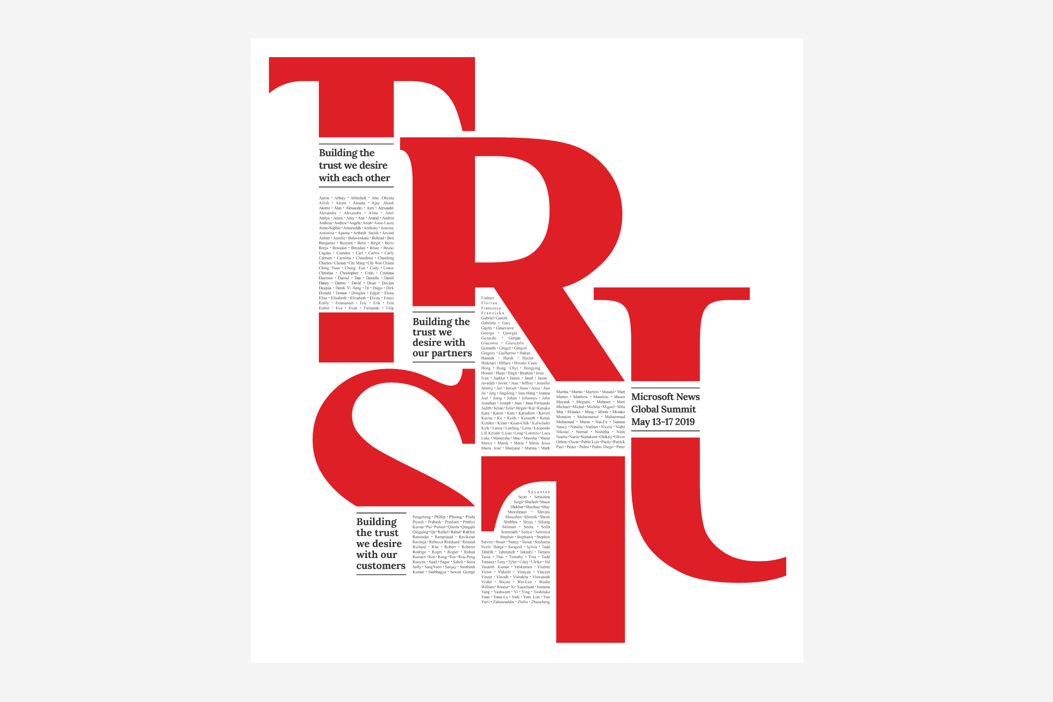
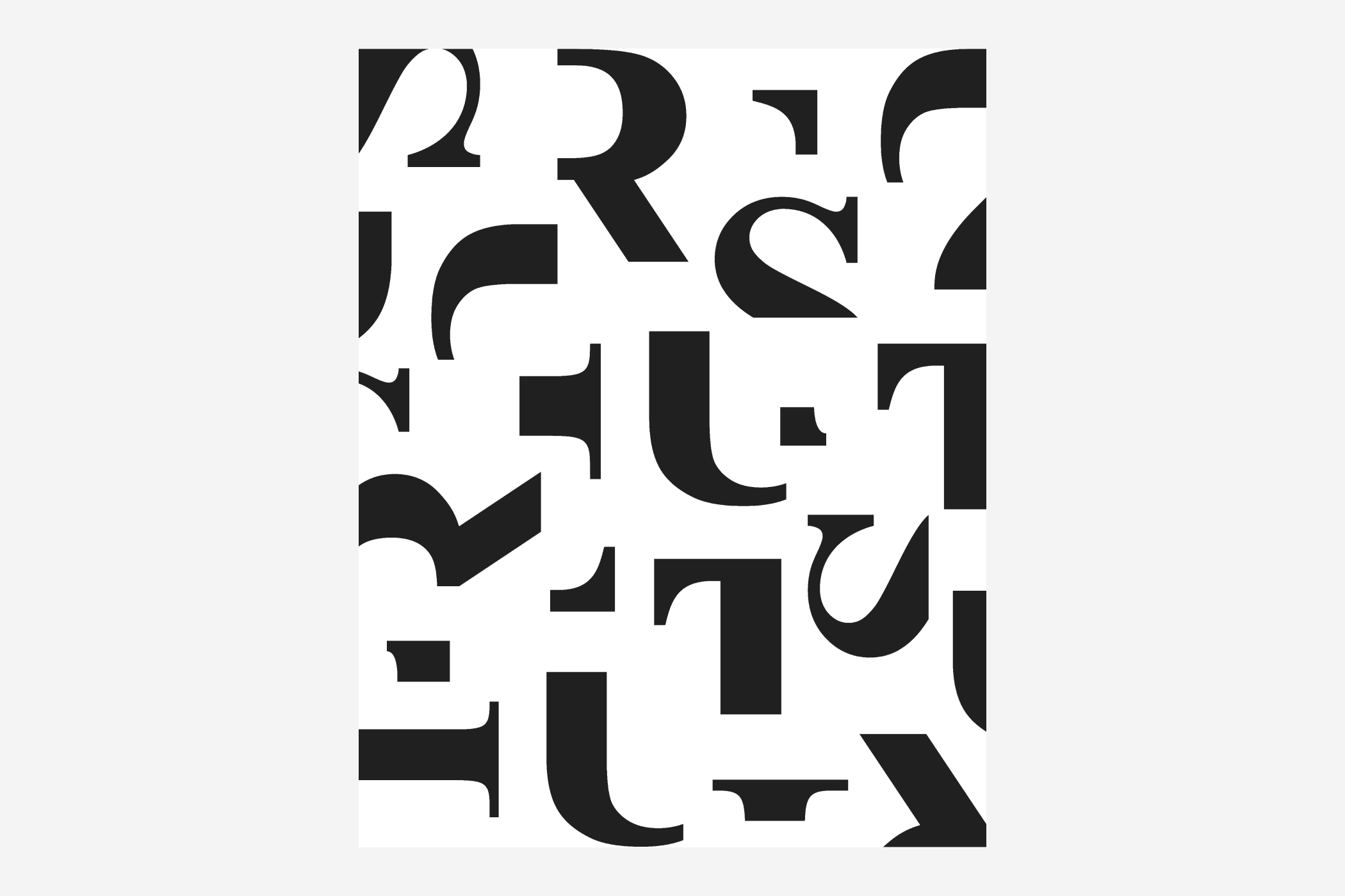
CONCEPT ONE / TRUST
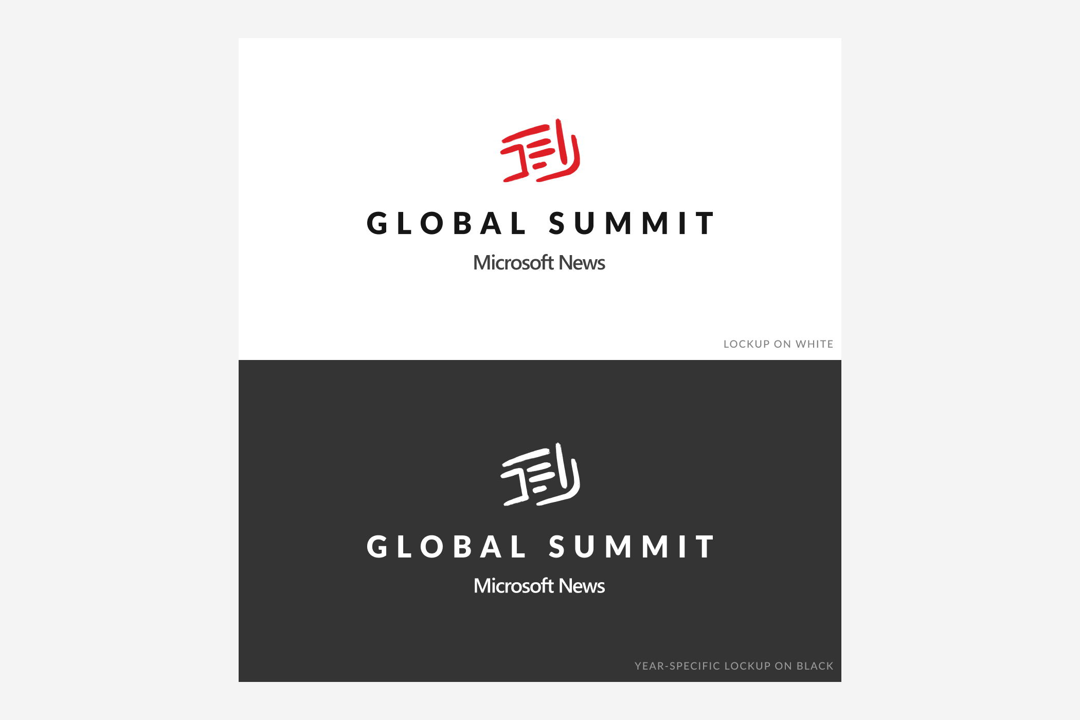
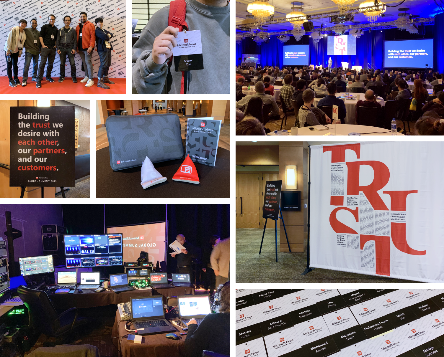
For ease of use, two logo lockups were created to serve the purpose of general summit branding, and year-specific usage. The central graphic identity of the summit (the TRUST lockup) contains the names of all Microsoft News employees.
CONCEPT TWO / GLOBAL COMMUNITY
An abstracted representation of the Microsoft News app icon provides a visual identity that isn’t product- specific. It evokes movement, and a union of elements that symbolizes a team of diverse talents and perspectives. A celebration of news culture from around the globe, the visual theme of the summit centers around our global audience and their relationship with news.
Composed of the primary Microsoft colors, brush shapes, and patterns, the goal is to strike a balance between diverse ethnic visual themes (i.e. maximilism vs minimalism).
The first concept was selected as it best aligned with the intent and theme of the conference.
After the event took place, I collaborated with our motion design team who produced animated posters based off of the graphics I created for the summit. One video animates the TRUST lockup to emphasize and bring together the principles that define the news team. The second video reamagines the TRUST type pattern as a plinko board. These videos remain on display in the hallways of the Microsoft News offices.
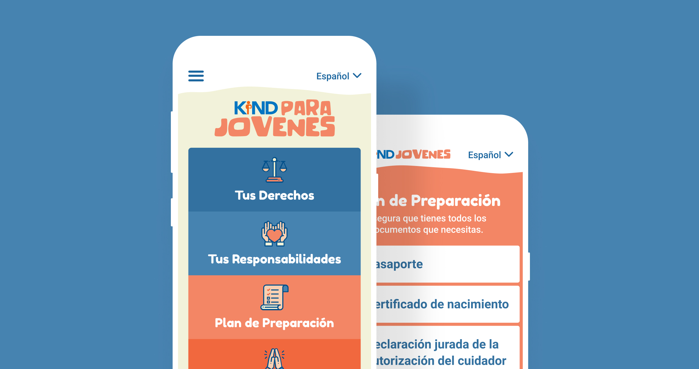
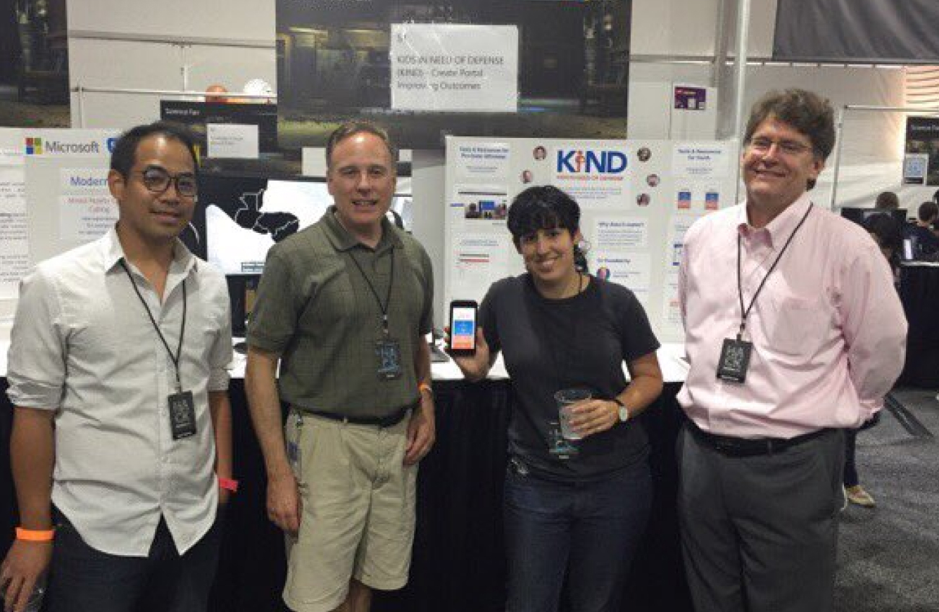
KIND Para Jovenes
In 2018 I participated in the annual Microsoft Hackathon under the Hack for Good category. The project was in collaboration with Kids In Need of Defense (KIND), a national organization that addresses the gap in legal services for unaccompanied refugee & immigrant minors in the U.S.
CHALLENGE
Children lack the language and resources to prepare themselves for the onslaught of legal terms and procedures they are about to experience in the immigration process. Many resources and tools crucial to their understanding of their rights and responsibilities are difficult to attain as they are decentralized.
BRIEF
Along with the social and legal services KIND provides unacompanied minors, each youth is loaned a smartphone to help them remain in communication with their social worker. By creating a mobile webportal, youth can access the resources and tools they need in one central location.
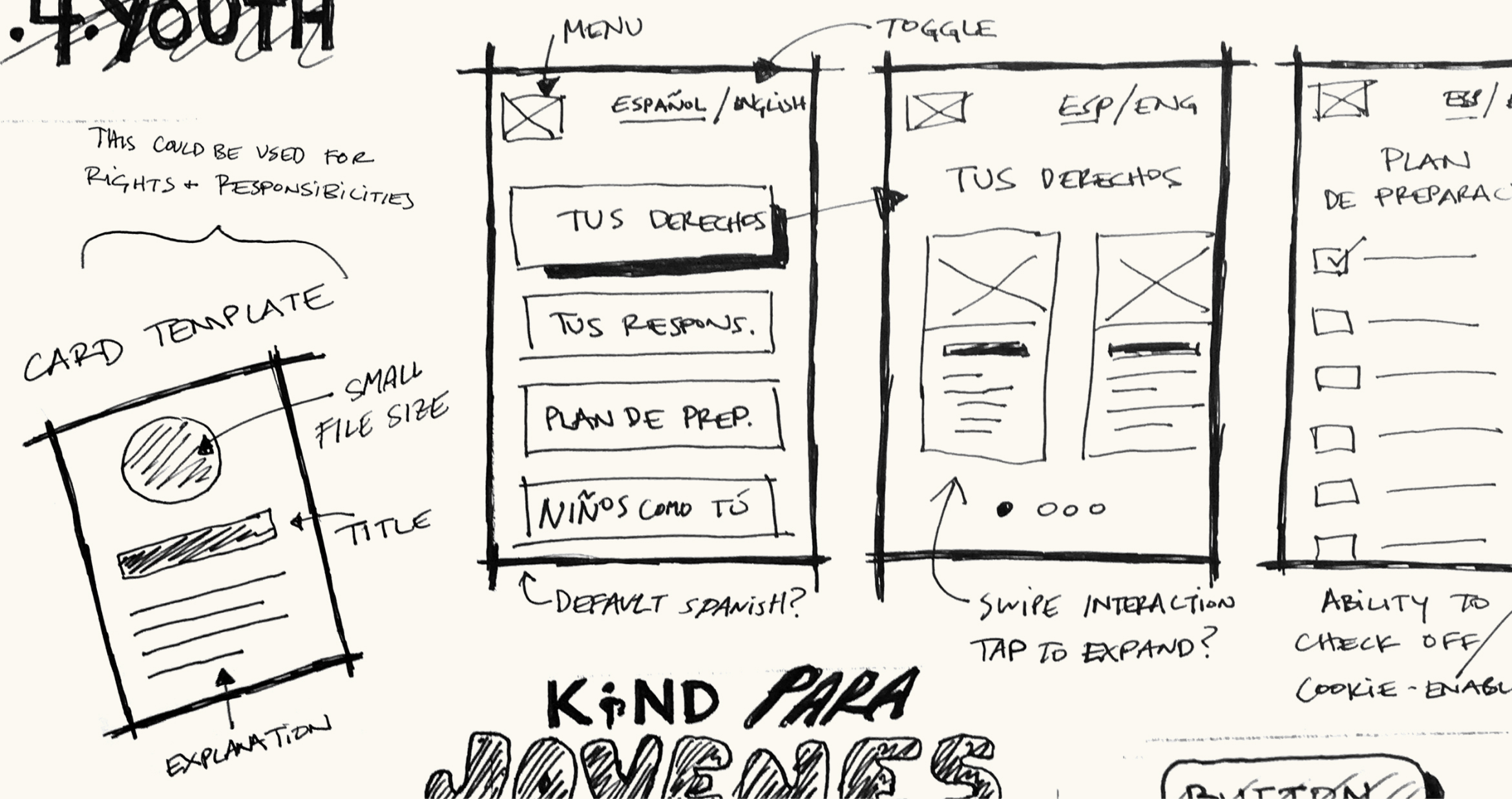
Content for the site was provided in the form of links to various pdfs and websites across the web. I organized the information into 3 buckets: Rights, Responsibilities, and Important Documents. From there I tackled how to best strip down wordy bullet-points into more manageable take-aways. I first edited the copy in English, opting for simpler vocabulary wherever possible, and then translated to Spanish. The more legal-heavy text was translated by a bi-lingual attorney on the team.


Once the content was in place, I looked to kid-friendly interaction patterns, colors, fonts, and lightweight illustrations that could bring the site to life. I was fortunate to find a free-to-use icon library online, and created a color palette inspired by KIND’s logo. I started designs in Sketch so that I could easily export assets to devs, and then switched to Proto.io to build out a prototype that could be shown at the end of hackathon share-out.
RETROSPECTIVE
It was great to see a project come together so quickly and from such a diverse group of talents and skills. Knowing we had a limited amount of time to build this, I made sure to create a design that could scale with the addition of new features or content.
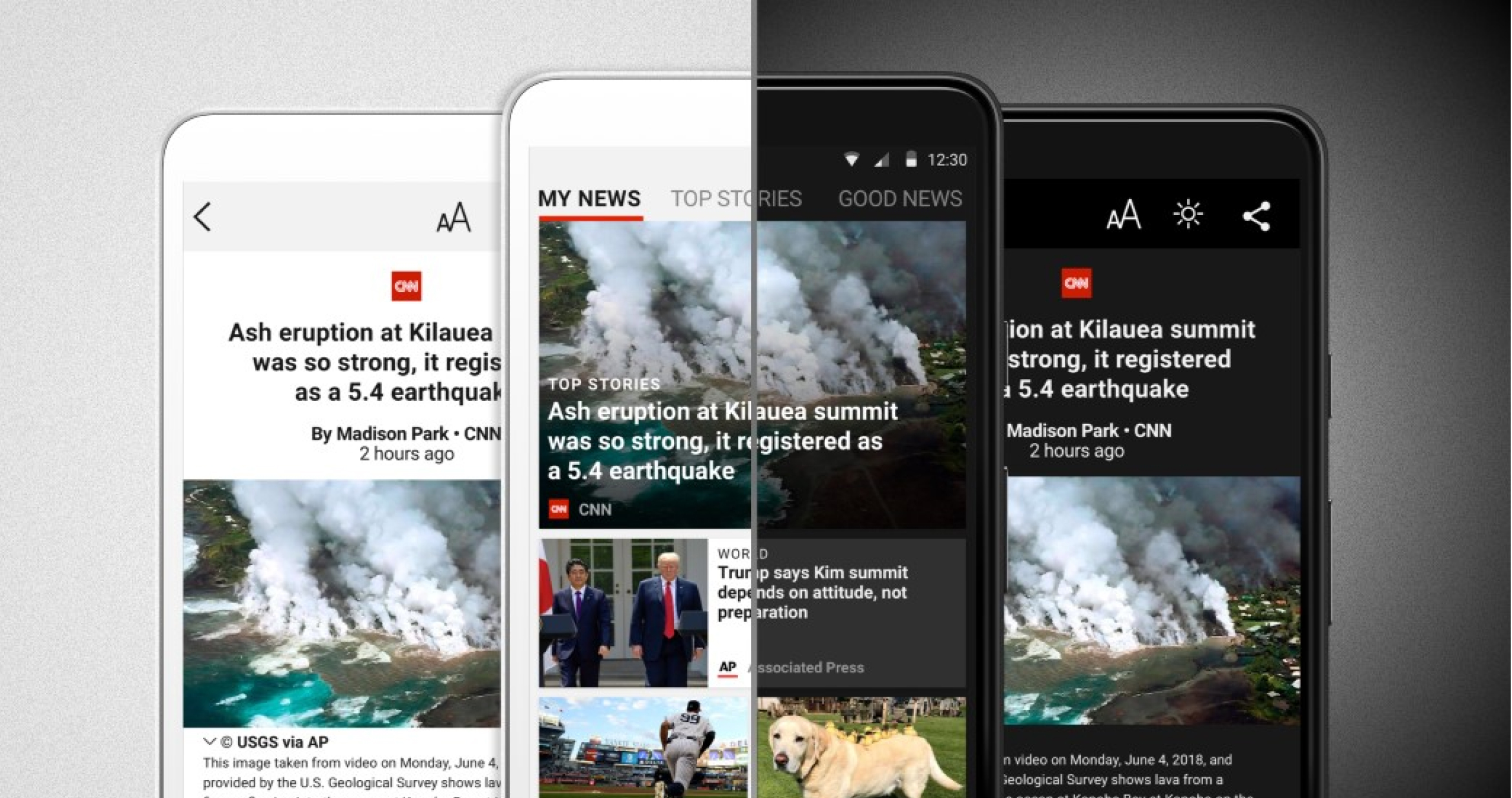
Microsoft News App
I led the design effort in collaboration with a mid-sized team of developers and project managers. This encompassed establishing the information architecture, wireframing, visual design, and prototyping. The logo redesign was implemented after the app was built.
CHALLENGE
The original MSN News app was a disjointed experience that hadn’t been updated in four years. Navigation patterns varied across platforms and story previews were restricted to a single template that didn’t pass accessibility tests.
TARGET AUDIENCE
The MSN News app has almost half a billion readers in more than 140 countries. In most instances these are multi-device/platform users.
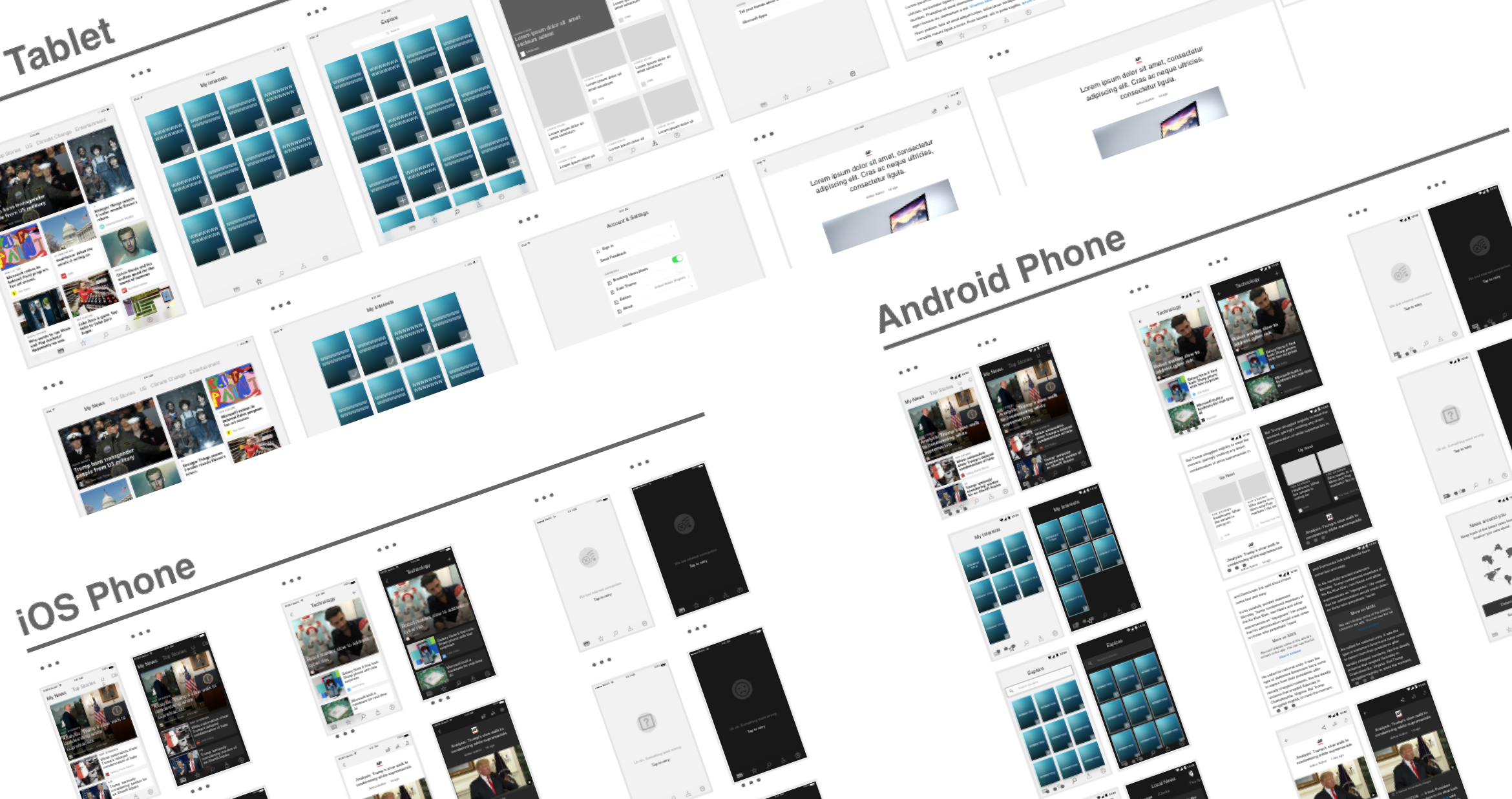
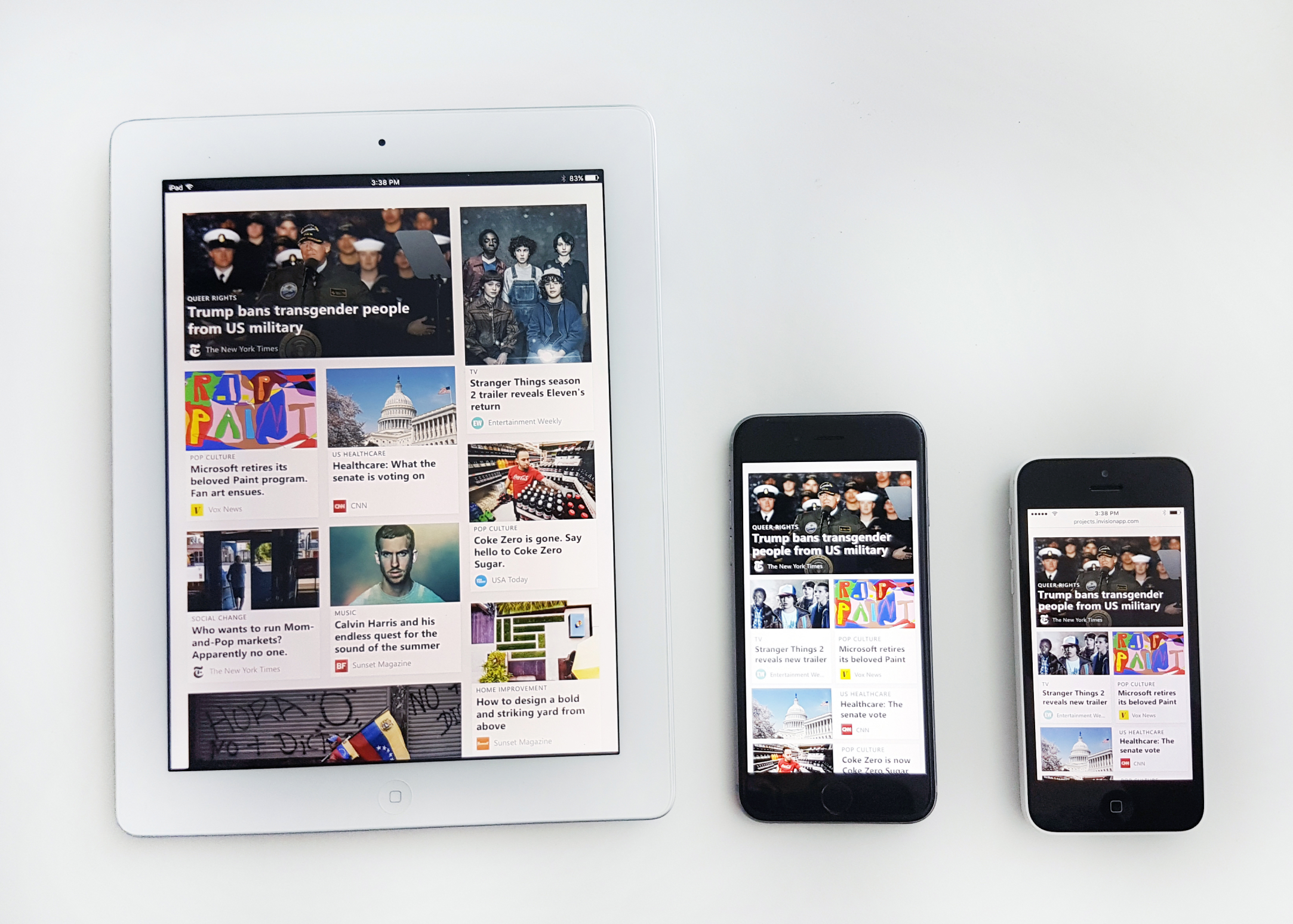
A grid layout with corresponding card sizes already existed for our desktop web properties, however it wasn’t optimized for smaller form factors such as tablet and phone. This required that I create a new grid system and set of card styles that could work across viewports. The final grid and card styles were established after testing prototypes across a variety of phones and tablets.
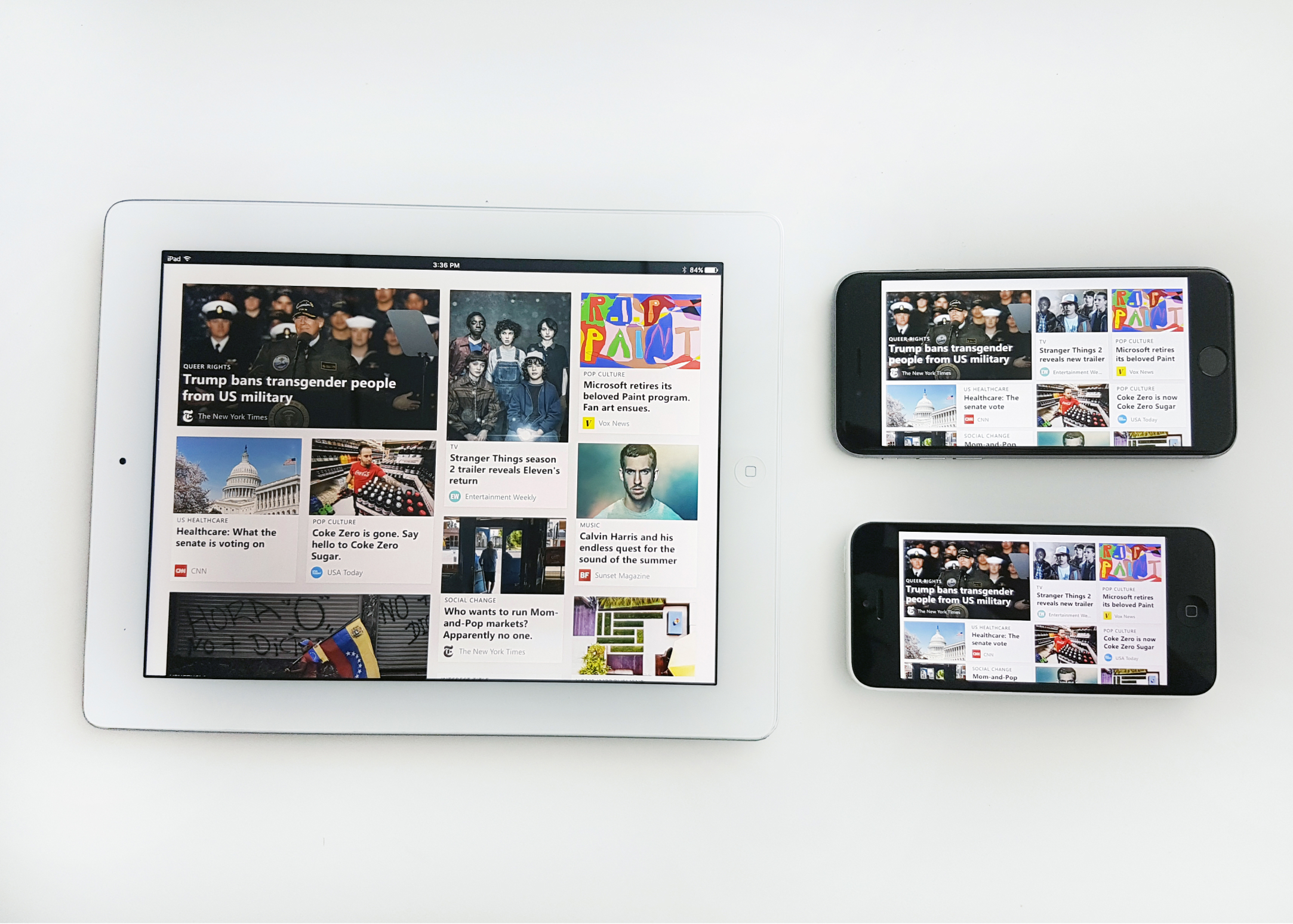
After establishing the grid and card templates, I tackled the app’s IA. This was an interesting exercise in balancing the immediate needs of the app with that of business goals that will eventually make its way into future updates. For this reason I divided the “explore interests” section from “saved interests” as both features will be evolving as the app matures.
The app redesign was finished after implementing the beta splash screen animation & first run experience. During the beta release, a separate design team implemented the new branding, which included a new name (Microsoft News), logo, splash screen and accent color.
Motion reel by Parker Young
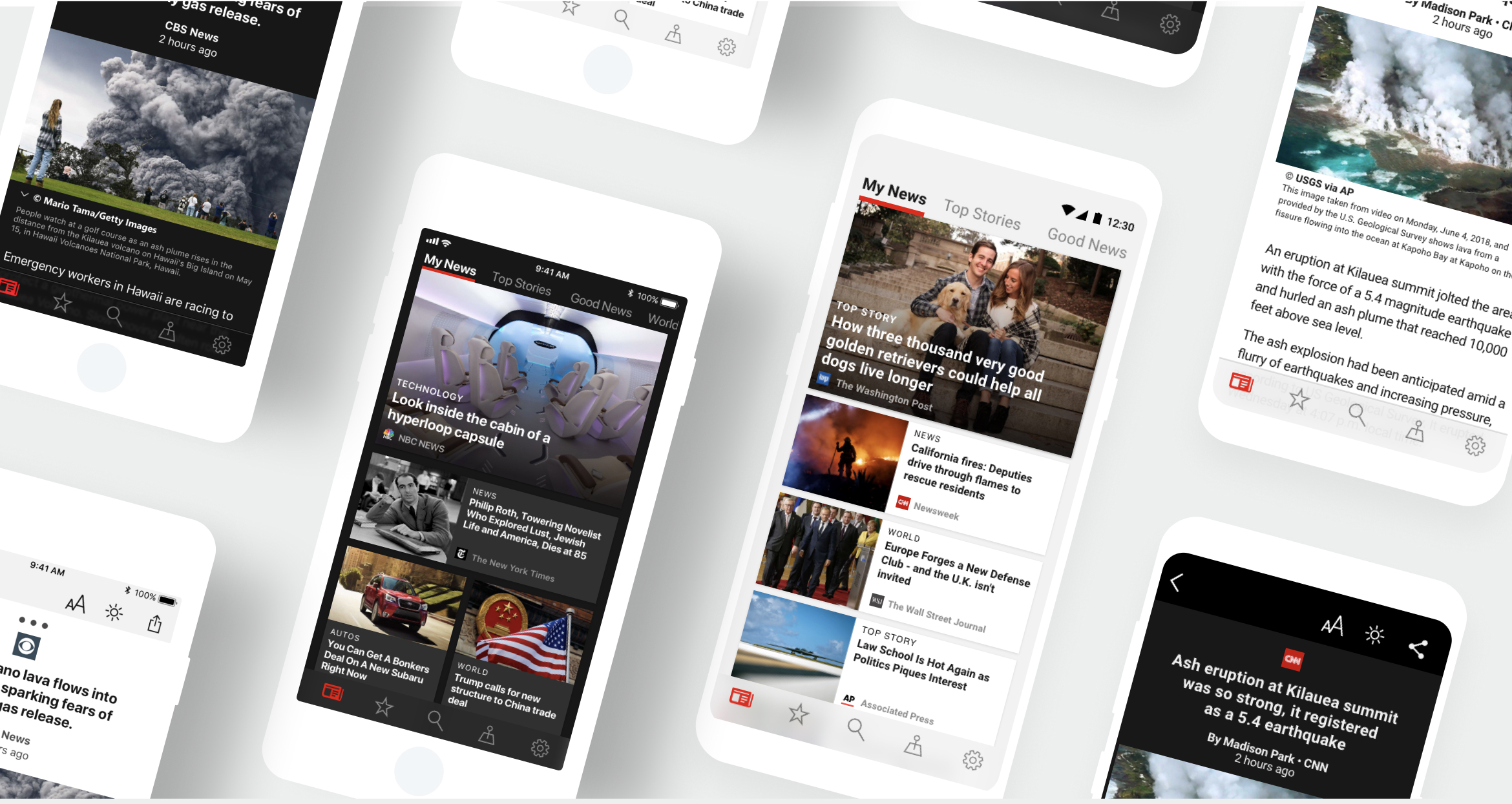
The app redesign was finished after implementing the beta splash screen animation & first run experience. During the beta release, a separate design team implemented the new branding, which included a new name (Microsoft News), logo, splash screen and accent color.
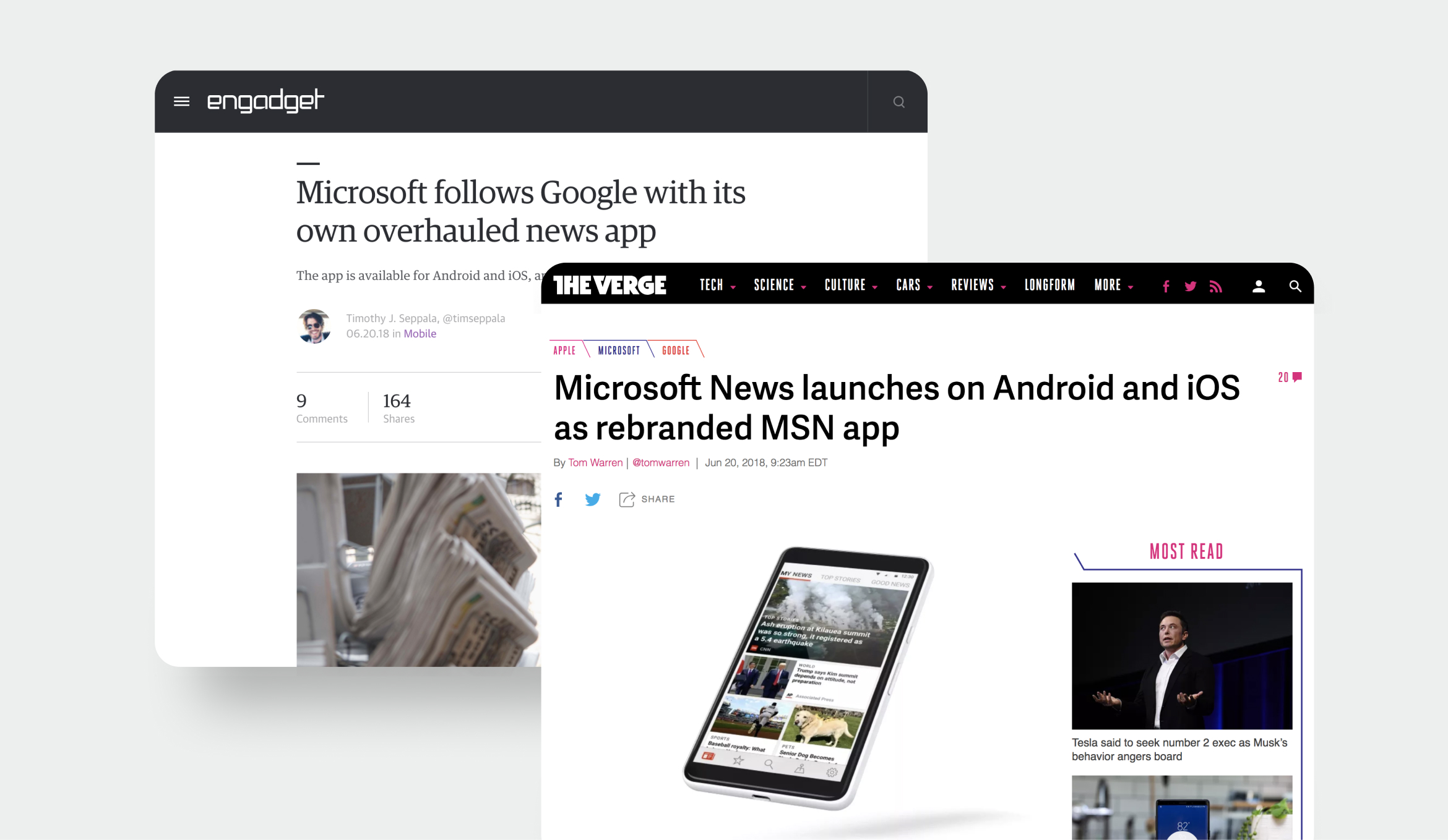
OUTCOME
Within the first week of launching, the app went from #103 in the news category of the Apple Store to #13; and from #51 to #11 in Google Play. Both apps have cumulative reviews above 4 stars and have seen 135k new installs. We also got positive coverage from several tech news outlets:
👏
“The newly designed Microsoft News app includes a dark mode, better integration with iOS and Android widgets, continuous reading, and breaking news alerts.” - The Verge
👏
“The interface of the app is clean and modern, and it isn’t cluttered with useless options...It runs just as smoothly as you’d expect it to & automatically adjusts the UI to different display ratios to fill the entire screen.” - Softpedia News
👏
“In terms of changes to the interface, the Microsoft News app has been designed to include more of a modern look. The update also offers a few new features to allow for a better overall user experience.” - Digital Trends
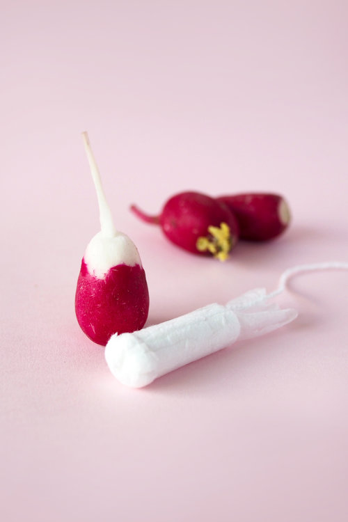
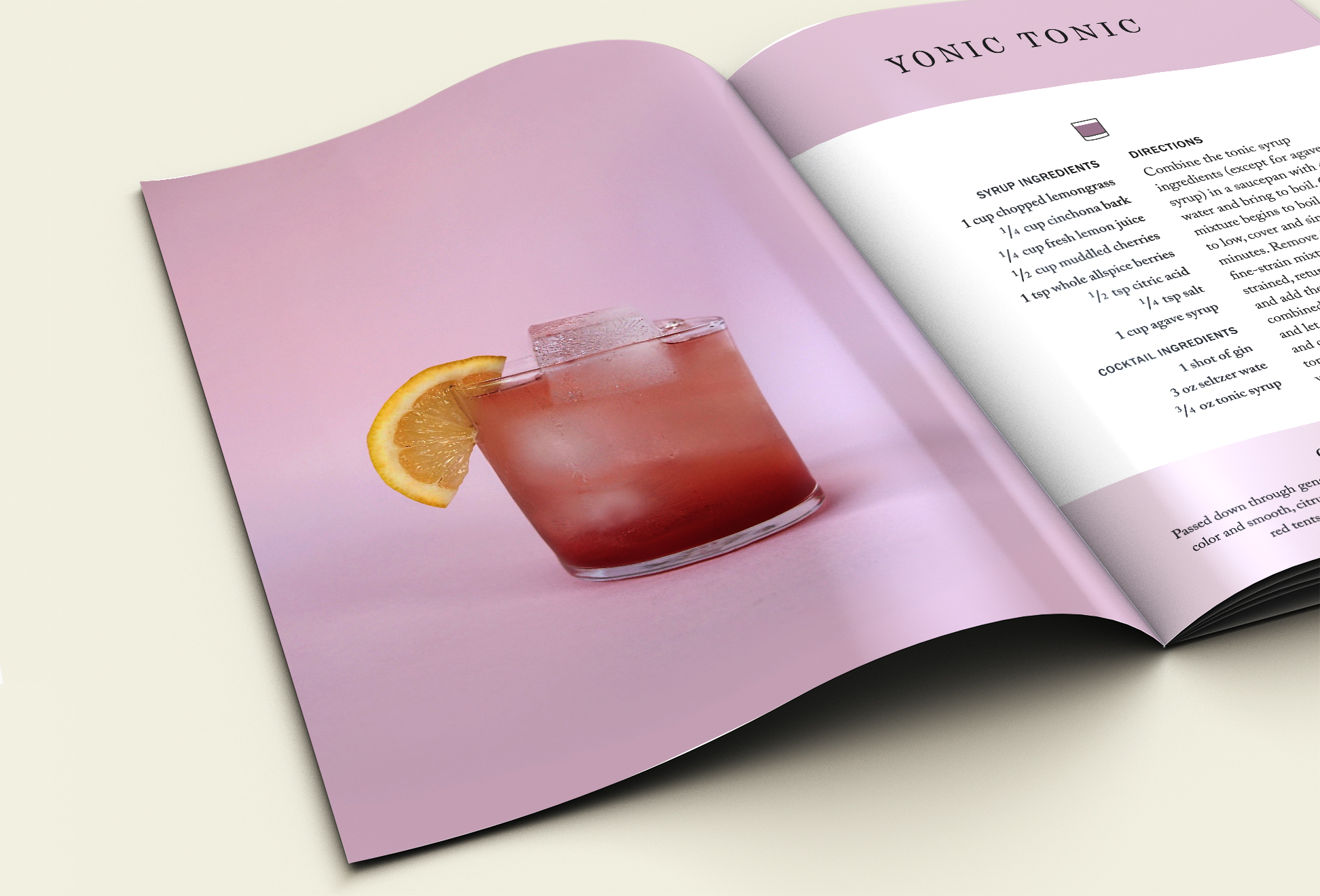
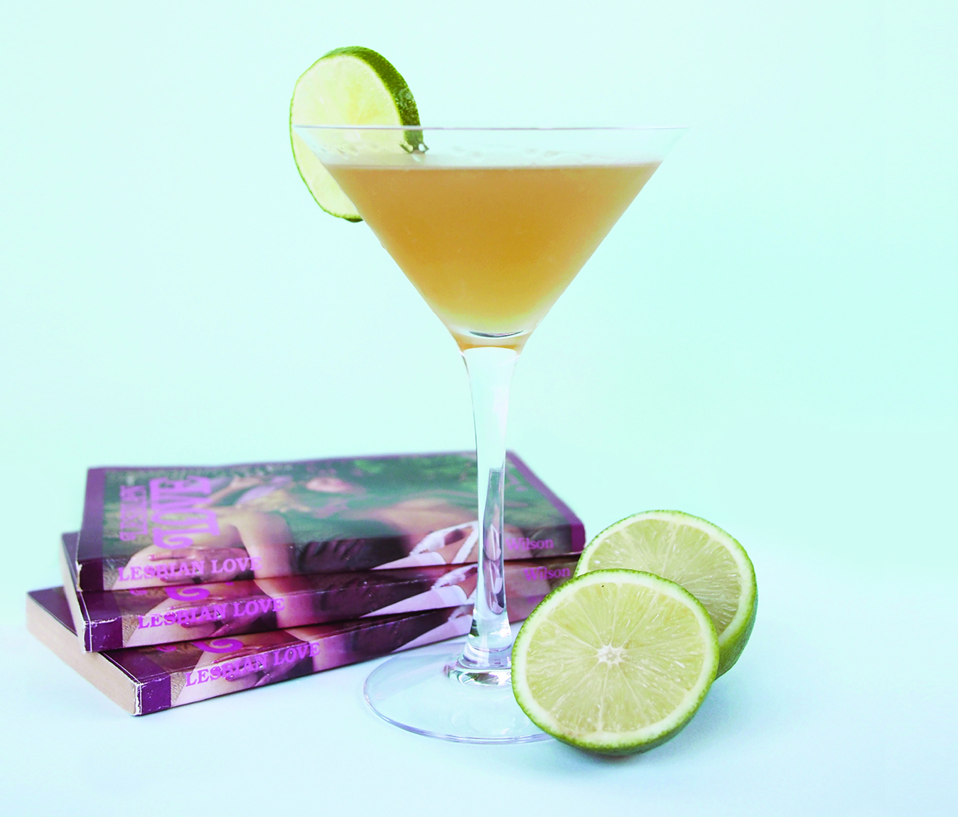
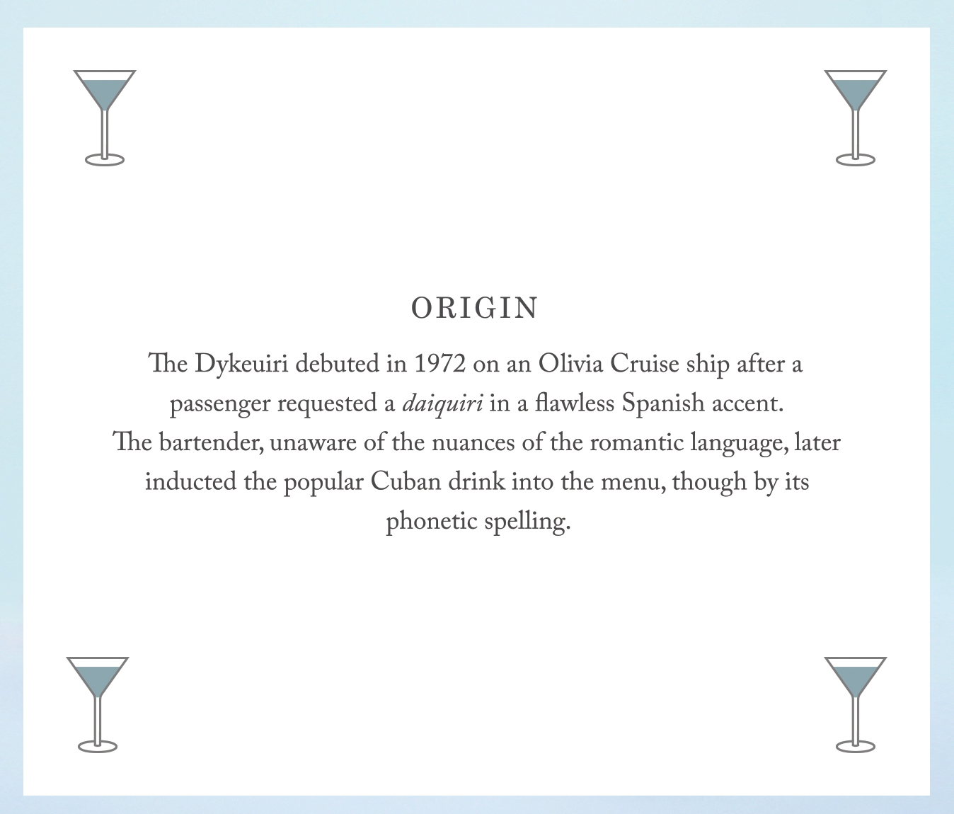
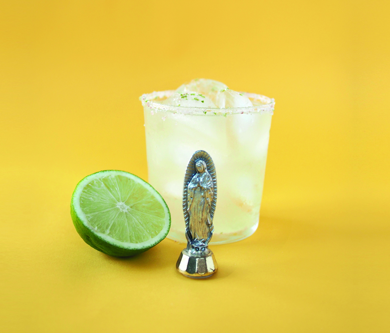
The Feminist Guide to Cocktails
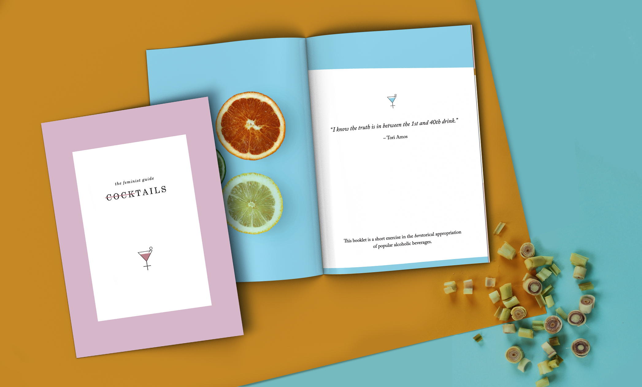
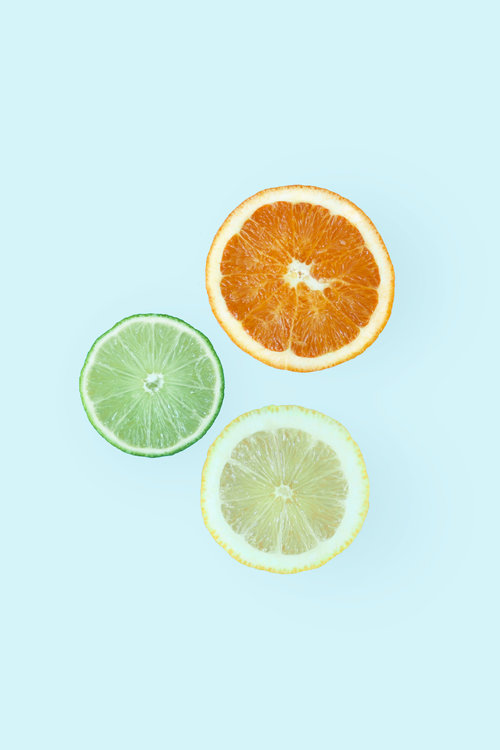
A little project I came up with to fill my spare time, The Feminist Guide to Cocktails was an opportunity to play art director, photographer, stylist, mixologist, and writer all at once.
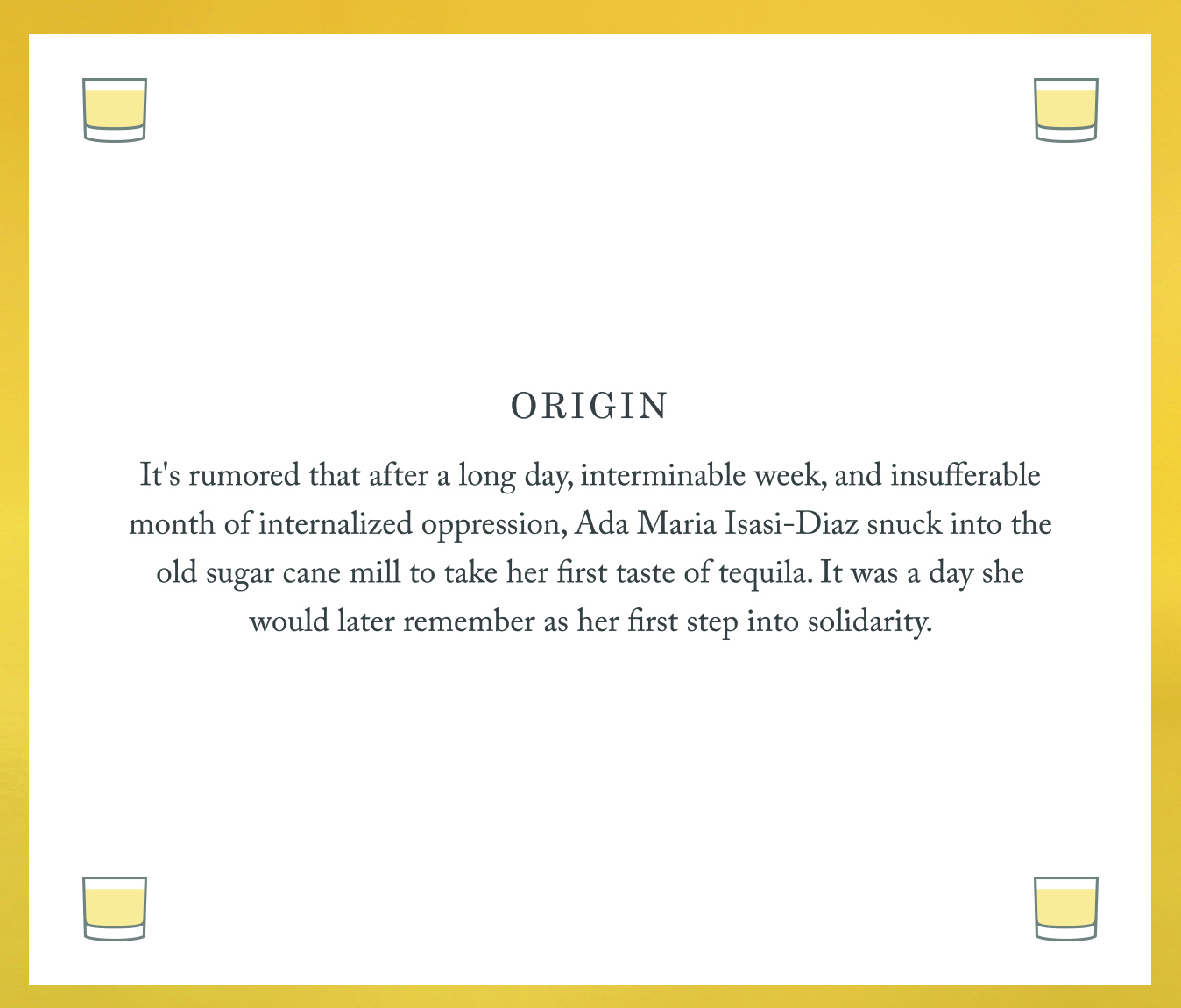
Each drink comes with an origin story influenced by famous womyn, pop culture, and herstorical moments that could have been. 50 copies were printed, and a tasting party was held for the signature cocktail, the Yonic Tonic.