


The other day I found myself in a neighborhood of Seattle I don't frequent all that much. I was on time to meet friends for dinner, but just barely. Not wanting the extra slow down of finding street parking, I opted for a nearby parking lot managed by Diamond Parking knowing the convenience would cost a premium.
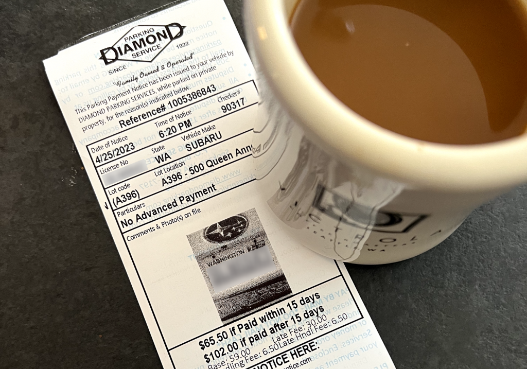
What should have cost me $19.42 for 3 hours of parking ended up costing $84.92 ($121.42 if I didn't get on top of it within 15 days). So, what happened? Shit UI.
I actually found this to be kind of funny as I spend the majority of my time working on billing interfaces used by 13 million customers around the world. I am too attuned to the hardships people encounter when trying to make a simple payment on a product or service (my reddit feed has recently been taken over by Facebook Ads subreddits, often filled with billing complaints). Payment engines are complex and a customer should be shielded from it as best as possible. Simple, linear user journeys can go a long way to reduce blockage and enable folks to spend freely.
In my case I was at the mercy of a mobile app named Call To Park. The first screen provides the options to login or sign up for an account. After a failed attempt at creating an account (turns out I already had one?) I got in with my credentials. I easily inputed my parking location and the desired amount of time.
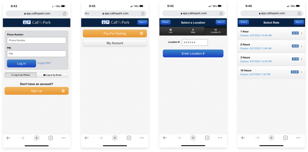
Then came the payment part. I'll give them props for integrating Google Chrome's form autofill. However, it was the error handling that took me a long time to figure out and resolve.
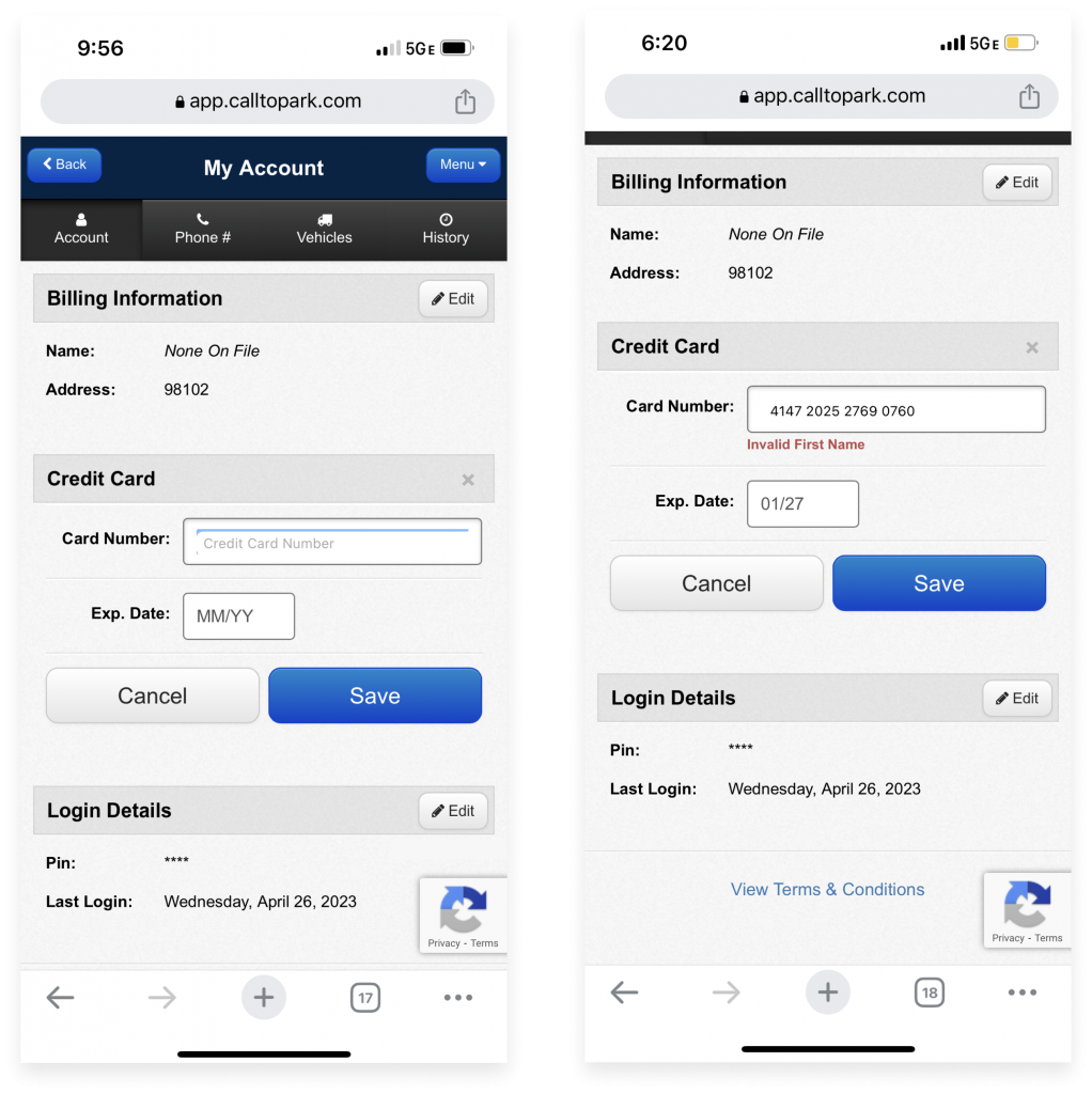
A few of my initial thoughts when this error happened: are there multiple fields within that input field? Did Chrome's autofill place the wrong value? Is the title "Credit Number" incorrect and should it actually say "Name" (and somehow the other required fields would appear after a name were entered)? At no point did I think to look at the content surrounding the Credit Card section. Billing information? Unnecessary. All they need is a valid payment method. And besides, if they needed that information wouldn't I see a contextual error message? Login Details? Absolutely unrelated to the task at hand.
At this point I was five minutes into trying to pay and late to dinner. So I resolved to continue trying while making my way for the restaurant. Once there, I decided to take a look at the "my account" section in the menu, see if I could get to the root of the problem.
At this point something clicked in my brain. I think it's because there was no longer a mix of static and interactive elements on the screen. Seeing that I didn't have anything on file for my name, credit number, and expiration date helped me put the pieces together and conclude that all fields were required for a successful transaction. As soon as I provided the information, I was able to complete my transaction and dig into my tacos.
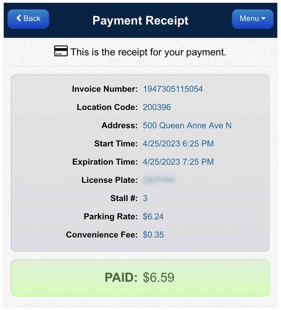
Fast forward 2-3 hours later... I return to my car to find a parking ticket. Call To Park's broken interface cost me $65.50 for the 5 minutes that elapsed. In retrospect maybe I should've remained in the parking lot for the 10 minutes it took me in total. I guess I'll find out once they reply to my ticket dispute.
It's week 7 of quarantine and my new norm consists of endless hours playing my Nintendo Switch, watching old episodes of True Blood, and communicating with friends and family on an assortment of video conferencing apps. FaceTime and Microsoft Teams have been my go-to prior to the pandemic (and remain in high use today), but I've since brought Zoom into the fold and have really enjoyed it. It isn't platform-specific (like FaceTime), and doesn't feel enterprise-specific (like Teams, which I've only known within the context of the workplace). Which is why Zoom emerged as the clear candidate for hosting my family's weekly hangouts.
My mom was already a daily user of Zoom and my sister, by virtue of being a millennial, took to it in no time. However, getting my Abuelos prepped for our first group video chat was another story. A bit about my Abuelos: They're both in their early 80s and are pretty tech-savvy. They have an iPhone 8, Samsung tablet, Roku stick, and PC. They bank online, check email on various devices, and use Instagram.
My girlfriend bought a Zoom subscription and set up the first test-run for my Abuelos. Together over FaceTime (an app they recently mastered) we walked them through how to download the Zoom app from the App Store on the iPad my mom loaned them. I could go into detail about the difficulties we had with the install process (Apple ID, need I say more?) but that's not the point of this write up. It was once the Zoom app was launched that my eyes were opened to the discrepancies between our respective onboarding experiences.
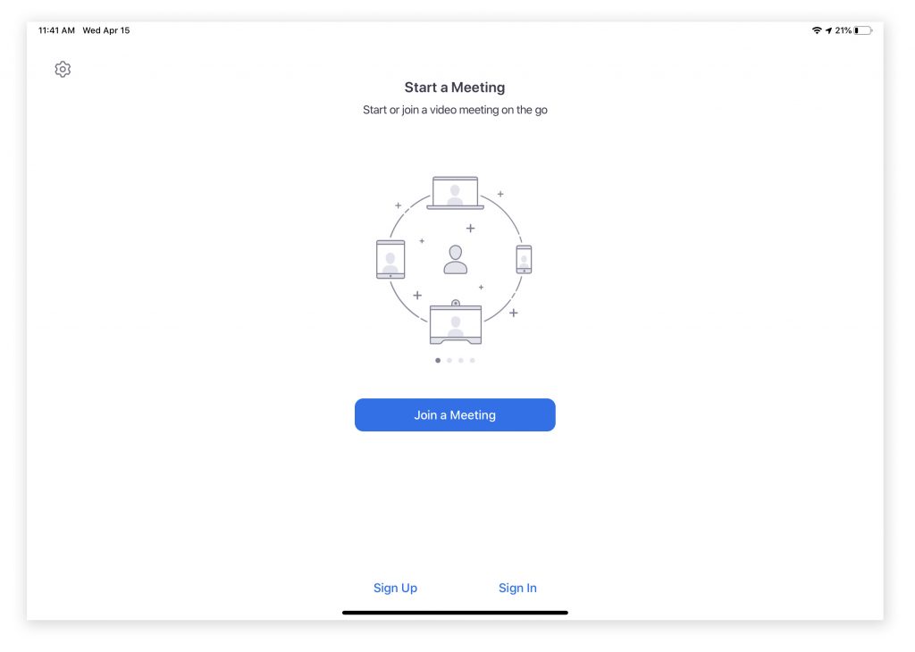
When I first loaded up Zoom I breezed through the screens. I didn't pay any attention to the call to actions in smaller fonts or the settings cog in the left-hand corner. I just went straight to the large CTA button trusting that the visual hierarchy of the page would lead me to the action I'd most likely want to take. This was different for the Abuelos, who gave equal importance to each item on the login screen (fig. 1). Their response to this screen opened my eyes to two learnings:
It's clear from the contents of this screen that the most important goal is to get people in a meeting--either by starting one or joining one. It could be helpful to include conversational text that guides a user to the action that matches their intent. In reading all of the text available on the screen, the Abuelos would've benefited from contextual guidance that echoed the language in the CTA buttons: "Do you want to join a meeting or start a new meeting?" (fig. 1.5).
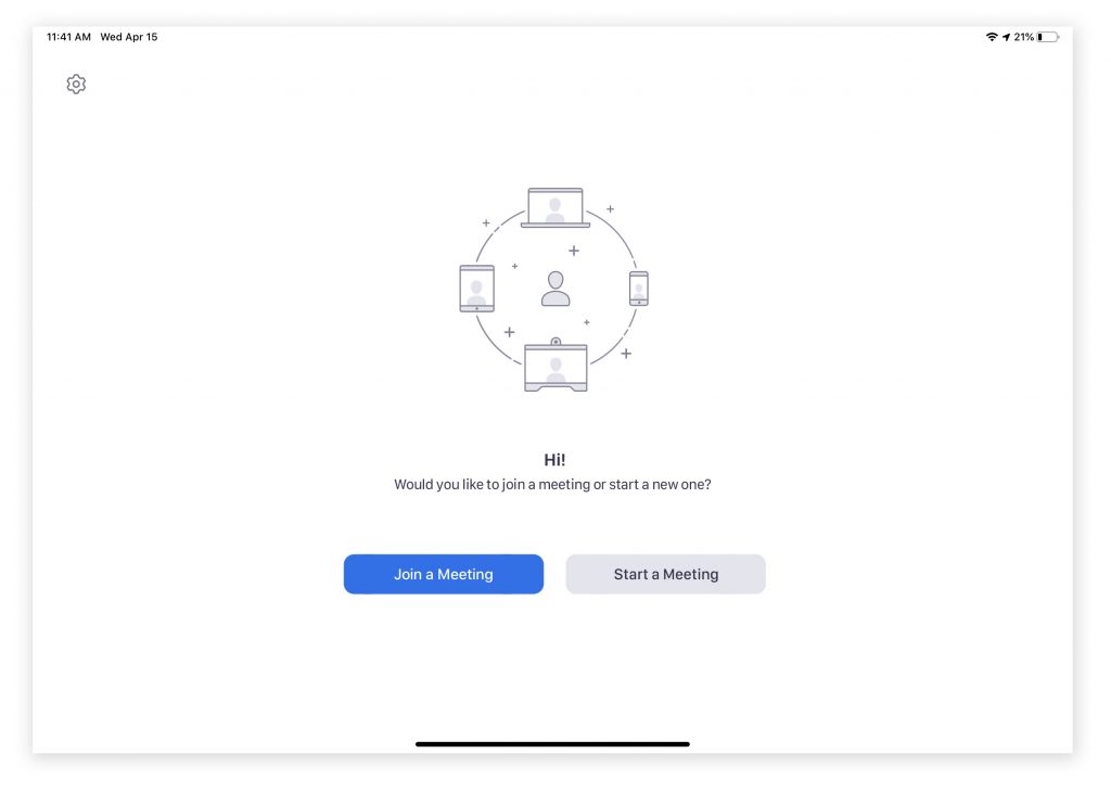
On the second point, I realized how accustomed I've become to having a marketing moment on the home screen to the point that I didn't even acknowledge it. It's an easy way to quickly run through the product features and orient the user. However in my Abuelos case they viewed it as a decorative illustration that happened to be sandwiched between text that had no relation to each other (Start a meeting vs Join a meeting). When looked at holistically it caused confusion, however the illustration on its own later came to signal for them that they were on the correct screen for joining a meeting. In this way they found a different way to engage with the carousel that brought value to their experience.
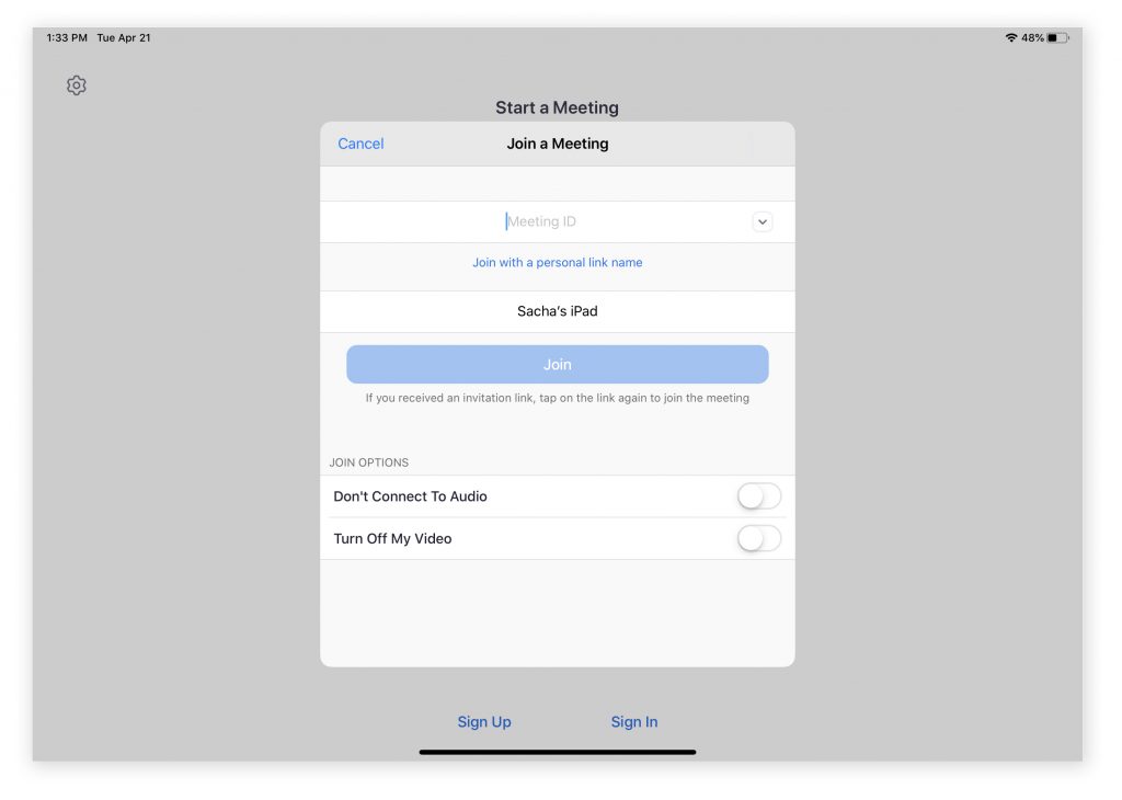
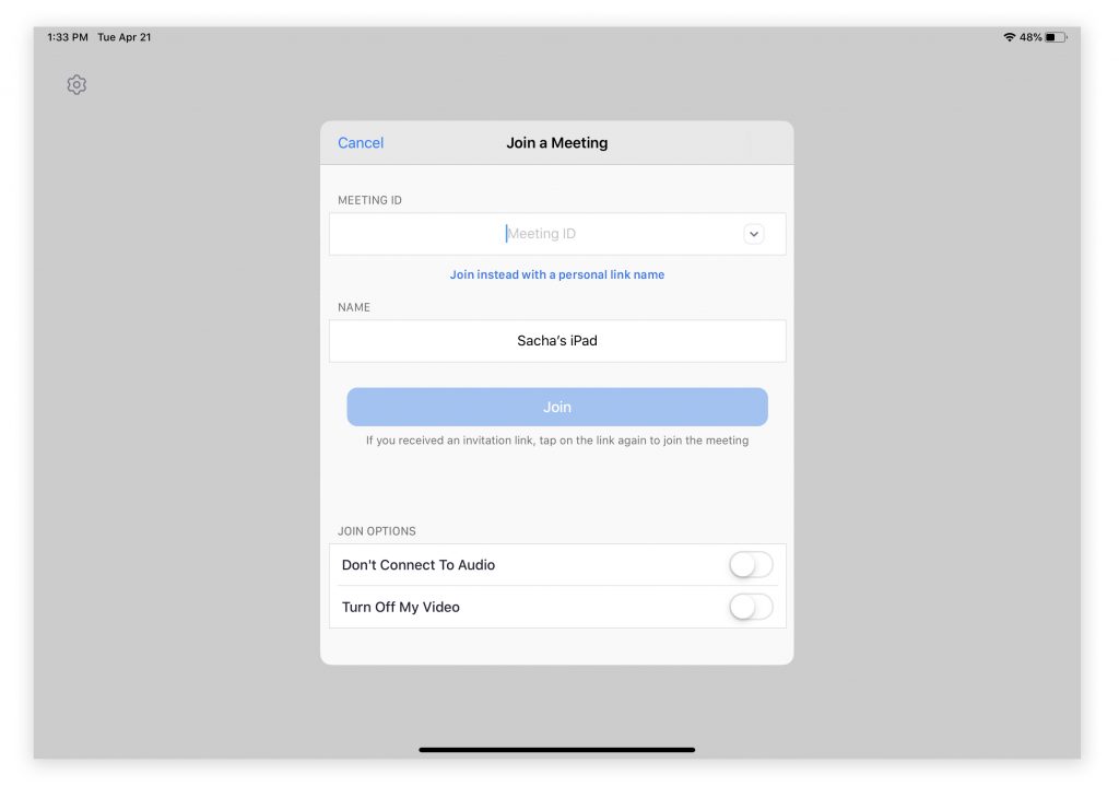
The second screen in our journey (fig. 2) proved to be especially painful to guide the Abuelos through because of its' treatment as an overlay. Upon seeing this screen, Abuela asked me if she should select "Start a Meeting", "Join a Meeting", "Meeting ID", "Don't Connect to Audio", "Turn off my Video", "Sign up"... Basically, anything visible to her in that moment was an equally important action to take. Rather than be focused on the path to join a meeting, she was distracted by the UI elements available beyond the overlay form. Positioning of the form was also unfortunate as the title for "Joining a Meeting" was preceded by "Start a Meeting" in a larger text size. By reducing this visual clutter (fig. 2.5), I believe Abuela could've focused better on the form itself.
It was also difficult for me to explain what it meant to "Join with a personal link name". As far as I knew Zoom meetings were joined by clicking on a link or manually inputting the meeting ID. It was at this point that I got out my own iPad and downloaded the app so I could see exactly what she was seeing and guide her better through the experience.
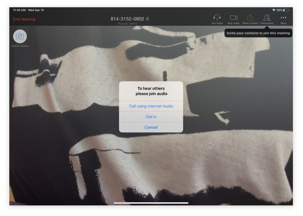
The final few hurdles we had to get through were all specific to the operating system: granting permissions, or as I explained to Abuela "Sigue empujando 'OK' y 'Confirm' hasta que se desaparecen." The last of the dialogue boxes to pop up came from Zoom (fig. 3), requesting we join audio but in a way that didn't make sense to any of us. Call using Internet Audio? Dial in? It would've been clearer to have indicated the device tied to the action. For example, use the audio of your iPad versus audio on your phone. It does raise a question: if a user has granted access to the app to use a device's microphone and camera, why not default to that option of audio input/output? However, elevating this settings control makes sense if Zoom is finding that a significant portion of their users are opting for dial in on their calls.
Since our initial test-run, the Abuelos have since used Zoom on two separate occasions. The first was a little touch and go after they unintentionally got stuck on a "sign in" overlay and didn't know how to get out of it (the only way out was a "Cancel" text link in the upper-left hand corner of the form). But the last call we had with them went extremely smooth and you could tell they were feeling more familiar with the interaction patterns. On that subject, here are some stray observations:
I’ve recently been engaged in several data-related projects that have taught me a lot along the way. Outside of geeking out over portfolios and books on the subject matter, my knowledge is limited when it comes to the methodology of collecting and visualizing data is pretty limited.
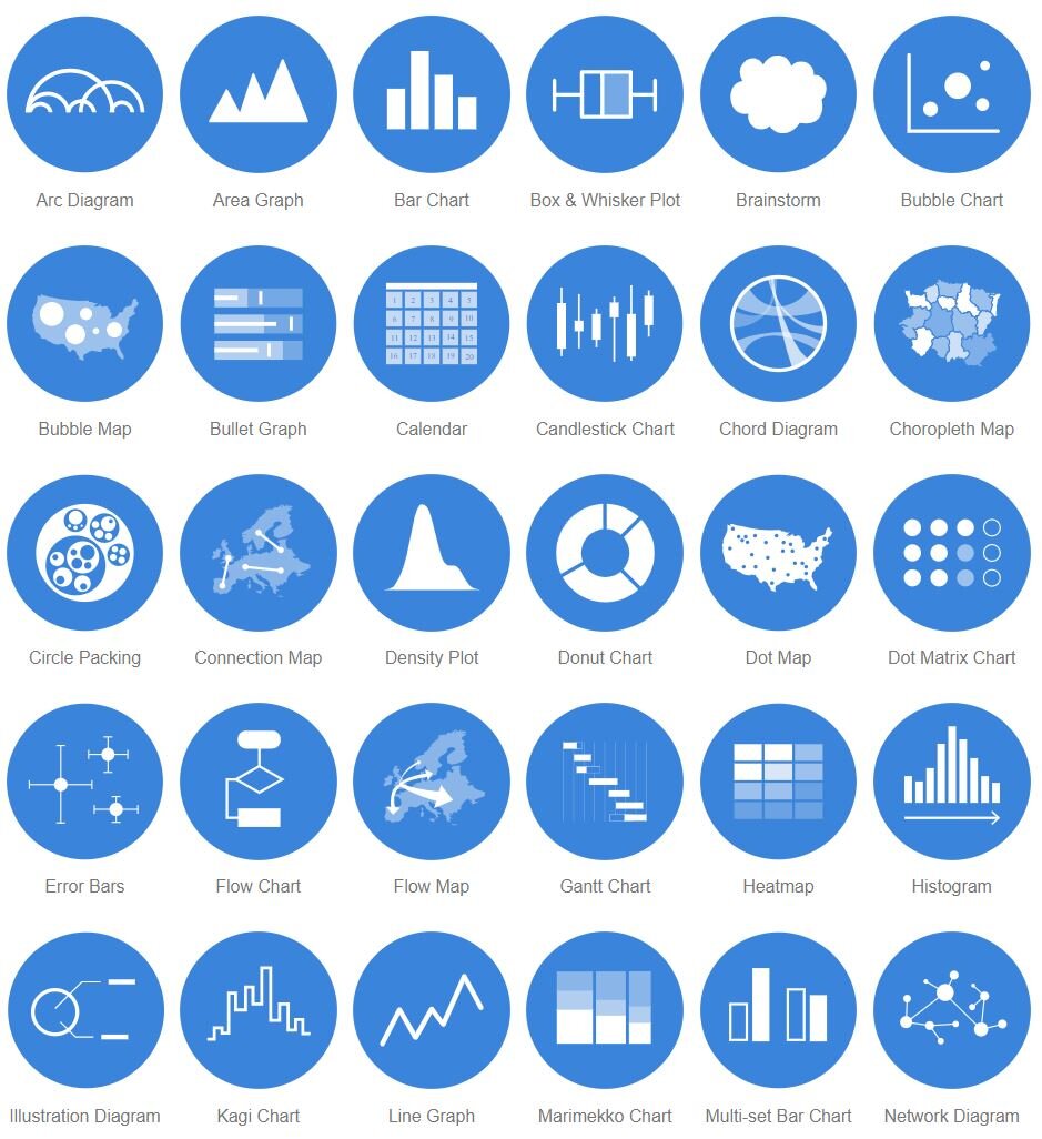
The first project that had me dig into this skill set was creating a customizable framework of data visualizations for our (Microsoft News) Elections 2020 experience. This is still in the works, so no photos to share just yet…However a resource I found early on helped me out considerably when deciding what graphics would work best to convey a data set. The website is called The Data Visualization Catalogue and is essentially a library of different visualization types, which can be sorted by appearance (i.e. bar chart, line graph, etc) or function (i.e. patterns, data over time, comparisons).
The second data-centric project I got to be involved with was an article for The Pudding that was researched, written & coded by Amber Thomas. I was brought in to help with design and visualizations, though the project was highly collaborative and I learned a great deal from Amber in regards to how data is collected and how sensitive it is to being manipulated by the wrong graphic representation.
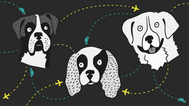
One such example was an early brainstorm we had about how to represent a North vs. South migration pattern. For context, the article we worked on looked at where adoptable dogs come from or are sent to using data collected from Petfinder. Below is the original graphic we created to show the direction of migration for each adoptable dog:
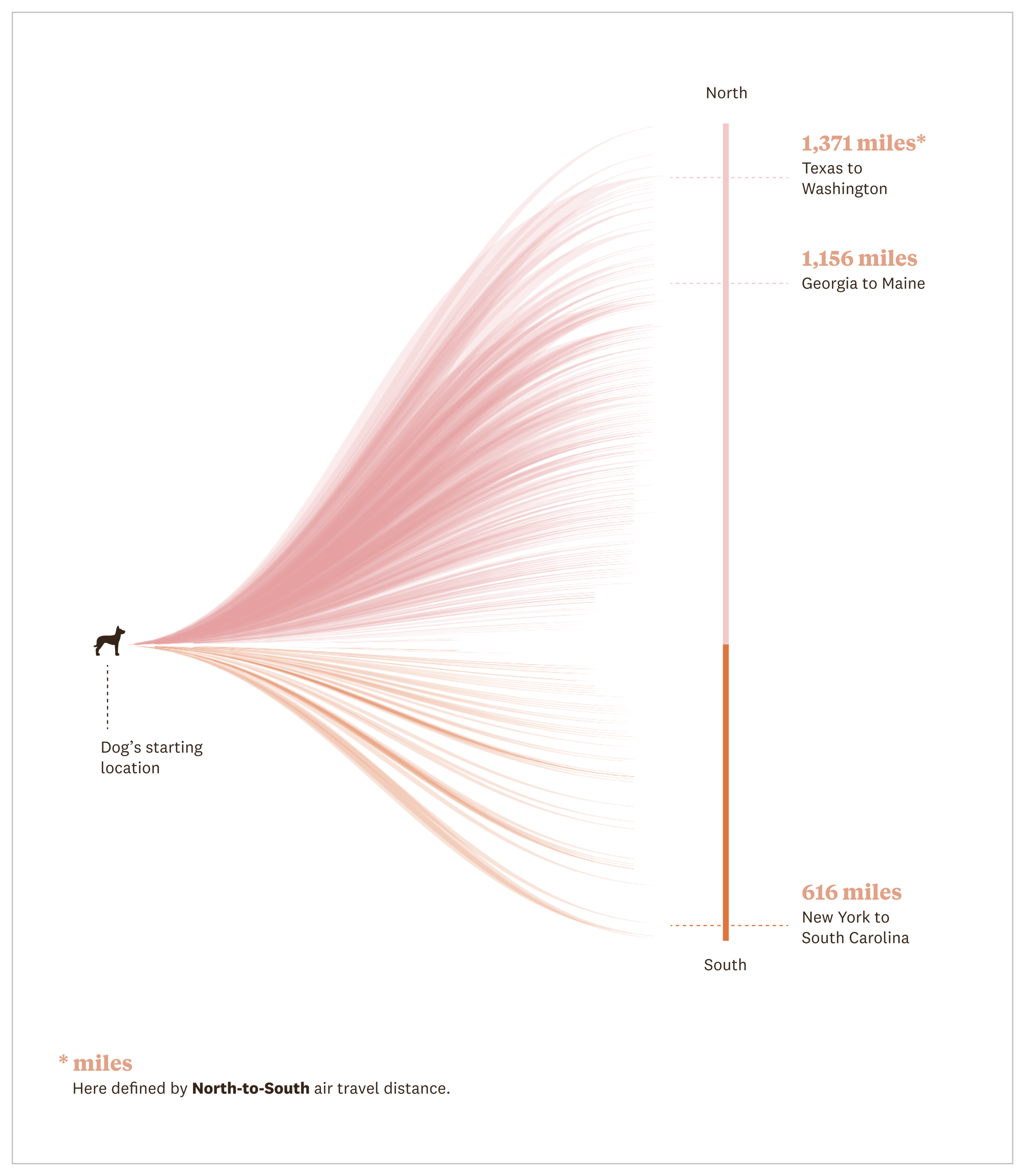
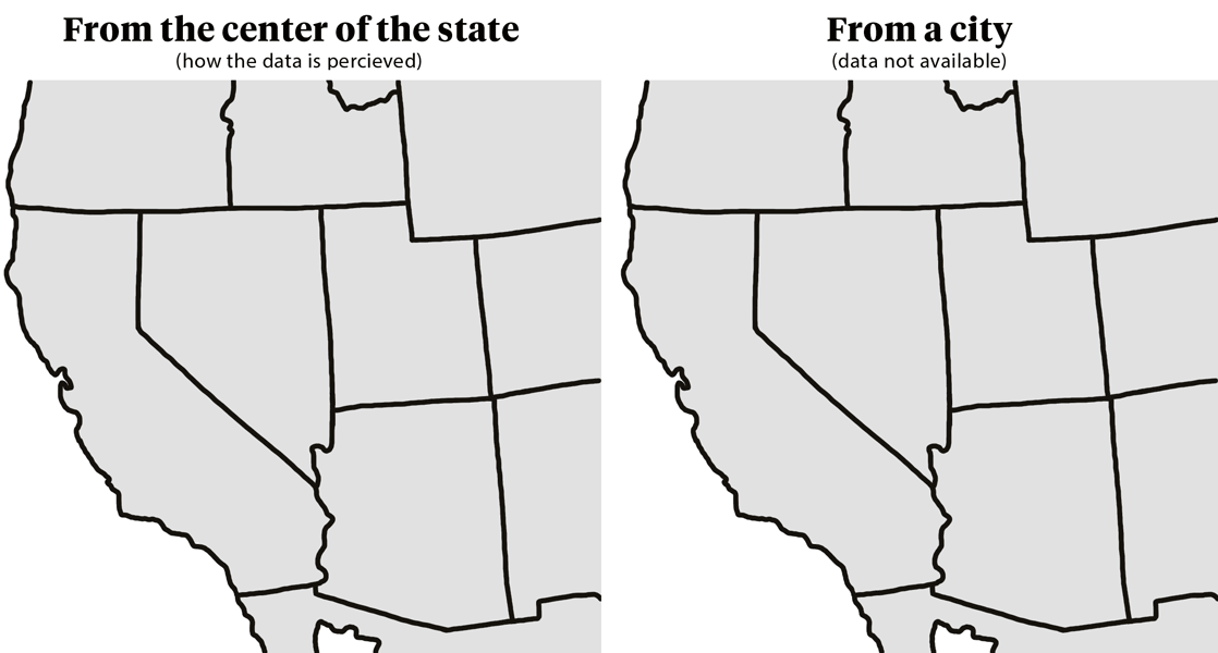
The problem with this visualization was that we only had available to us the origin & destination points as U.S. states, so a dog traveling from California to Nevada would register as having traveled slightly north as the distance being measured came from the center point of each state. This becomes problematic when you realize a dog could be coming from San Diego and travelling to Reno, a distance that is not only greater, but further north.
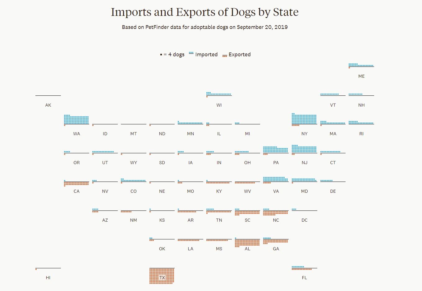
In the end we decided the best and most accurate way to represent this data would be to show the total number of exports and imports by state. This way the reader can quickly scan the two data points by location and see the pattern the data is showing, which is more dogs travel from southern states to northern states (with some exceptions).
Overall, lots of interesting learning moments and opportunities to flex my creative muscles by engaging in some interaction design and illustration. To see the whole article click here or the image below.
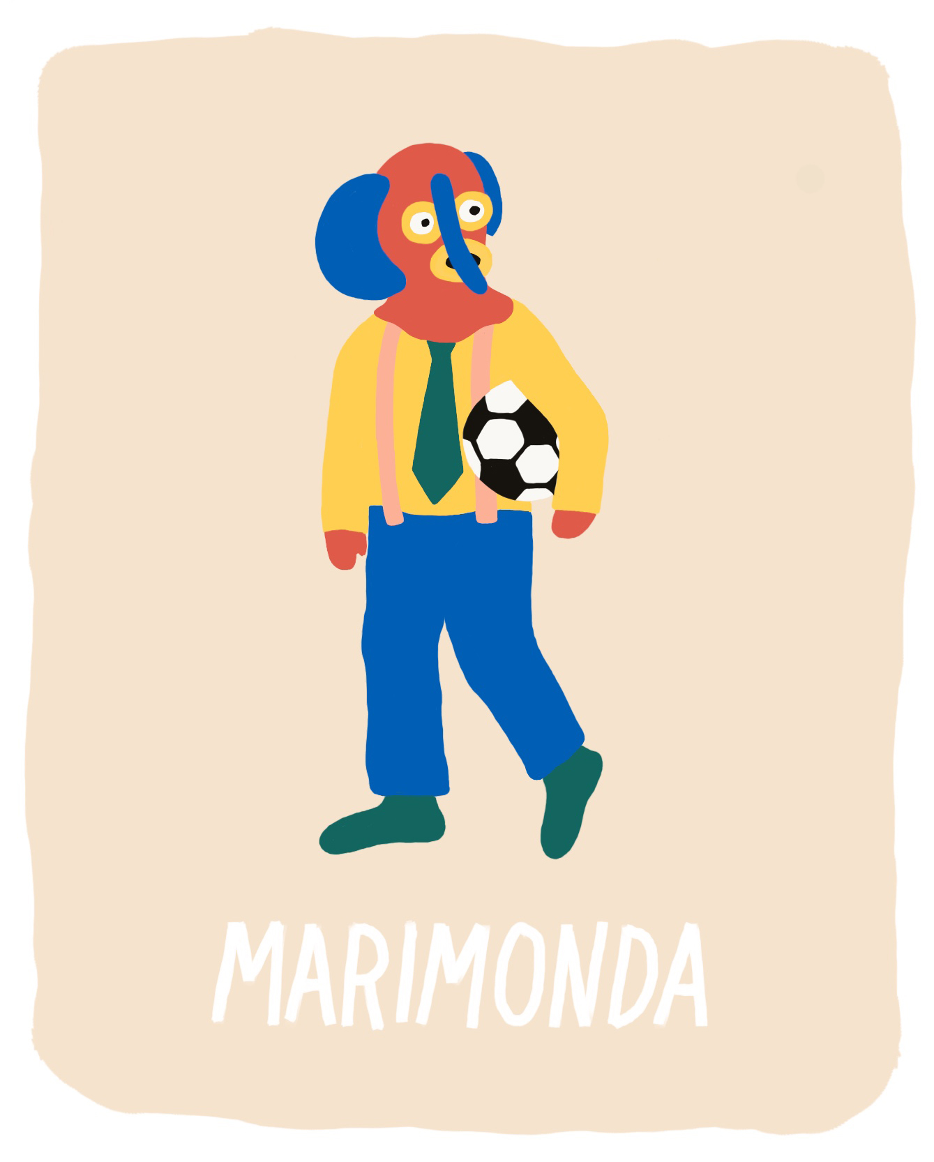
I’ve recently started playing soccer again. I’ve never been much for sports, but soccer was always the exception, partly because I viewed it as an extension of my Latinx identity. I grew up listening to Andreas Cantor boom out of the television speakers, while snacking on guacamole and rooting for Colombia or Venezuela—two teams that never really stood a chance of making it to the finals.
I would sing the Conavi Tiro de Esquina jingle whenever a corner kick was called, repeatedly murmur lagarto when the opposing team had a free kick on goal, and yell along with Cantor when a goal was made.
What got me thinking about all of this is that each time I’ve played soccer these last few weeks, I get a weird urge to blast Joe Arroyo on the car ride home. So here’s a drawing that sums up my feelings on the subject of soccer.